
Wanderlux Flight Booking Platform
Designing a full OTA flight booking experience for the GCC market from scratch in one day homepage, search results, and pre-booking details, across desktop and mobile, light and dark.
The Challenge
Design a full OTA flight booking experience for the GCC market from scratch in one day. Deliverables included a homepage, flight search results, and pre-booking detail screens across desktop and mobile, in both light and dark modes with dev-ready annotations.
The GCC travel market is saturated with established OTAs. The brief called for a product that felt native to the region not a re-skin of a Western booking flow while being fully dev-ready within the time constraint.
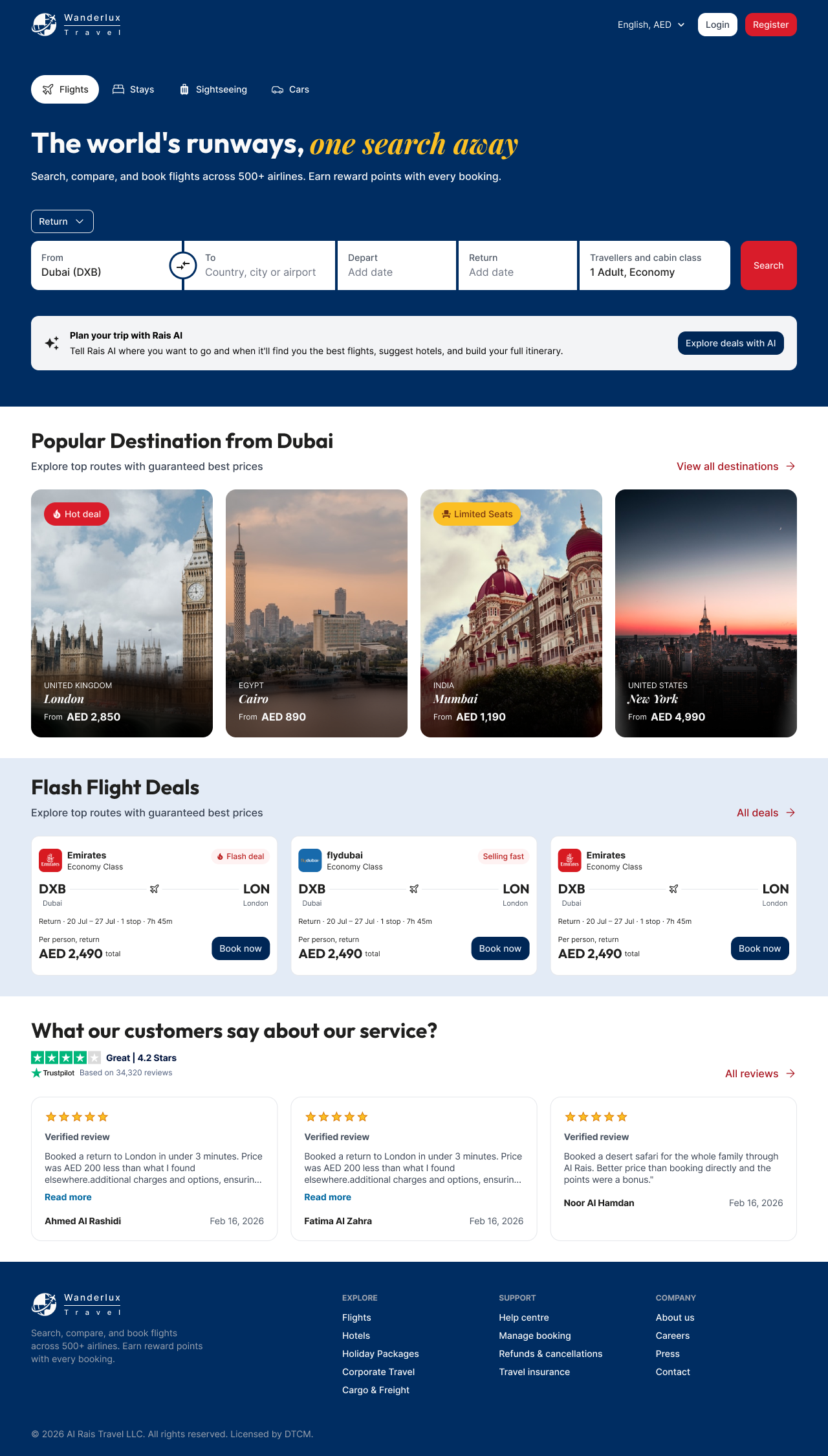
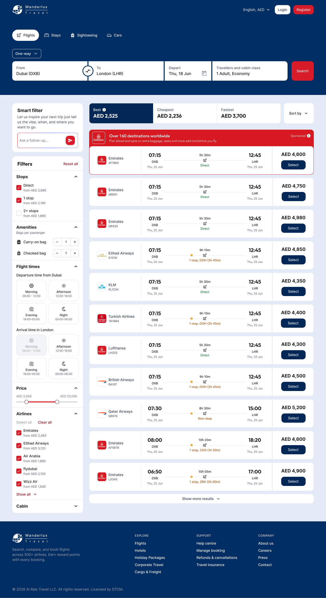
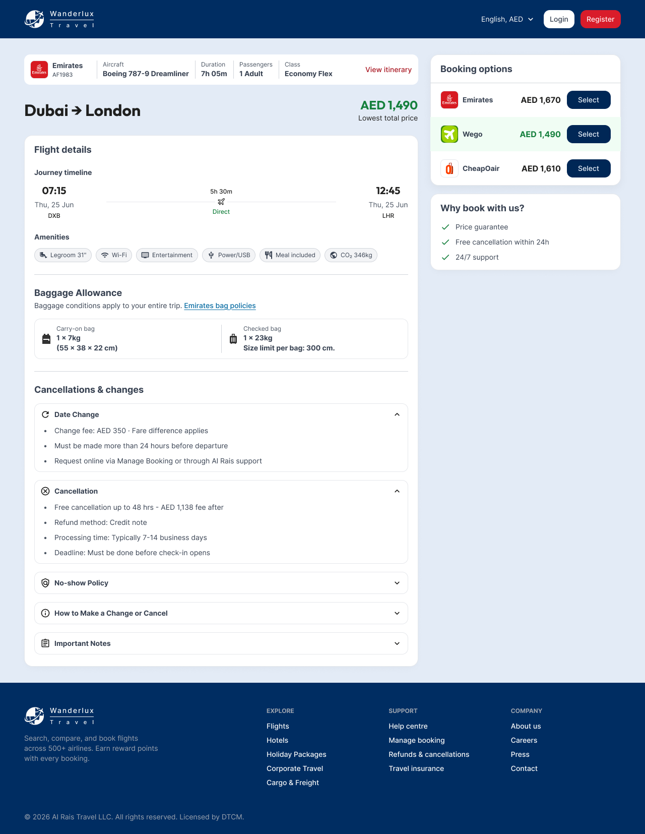
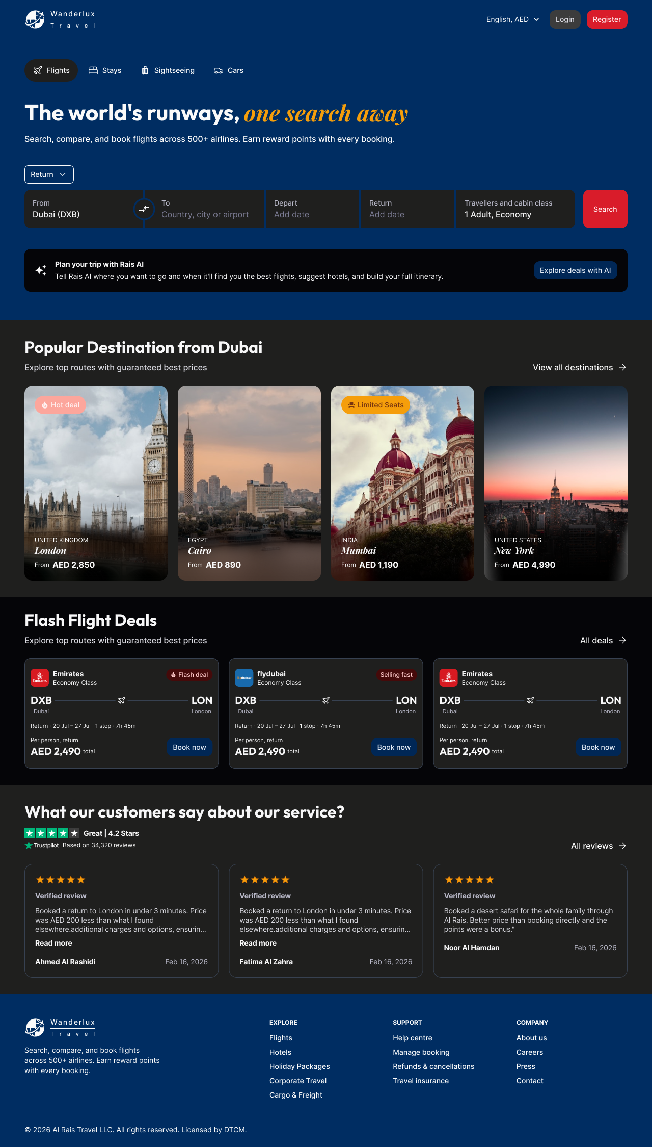
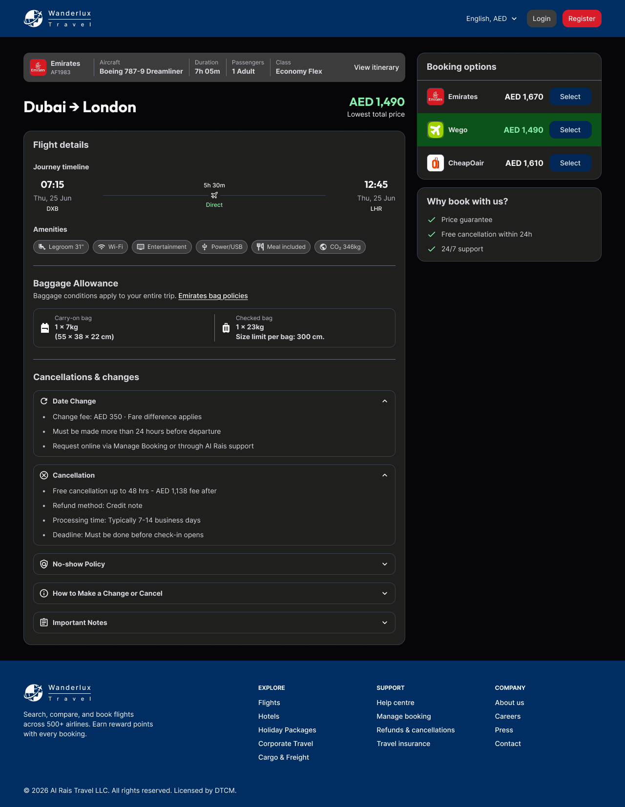
Desktop Light Mode
1280px · browser chrome
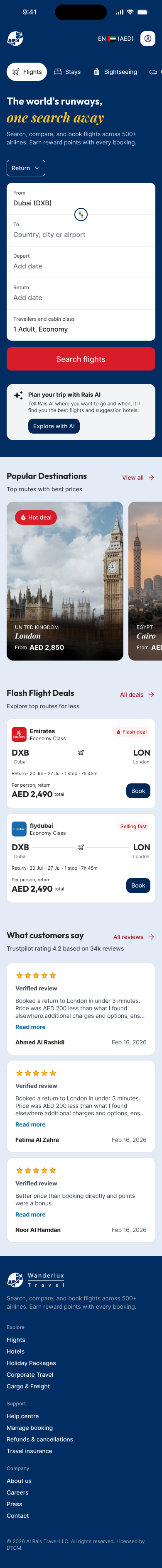
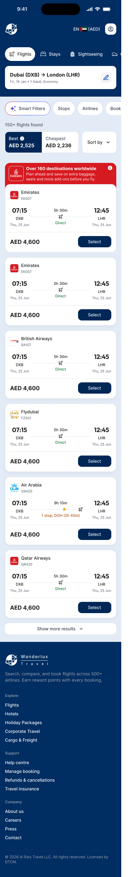
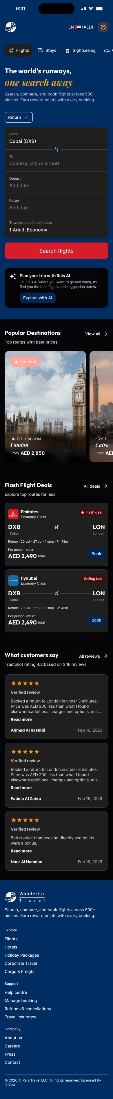
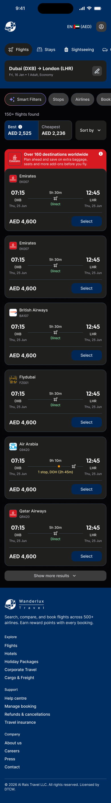
Mobile Light Mode
390px · iPhone frame
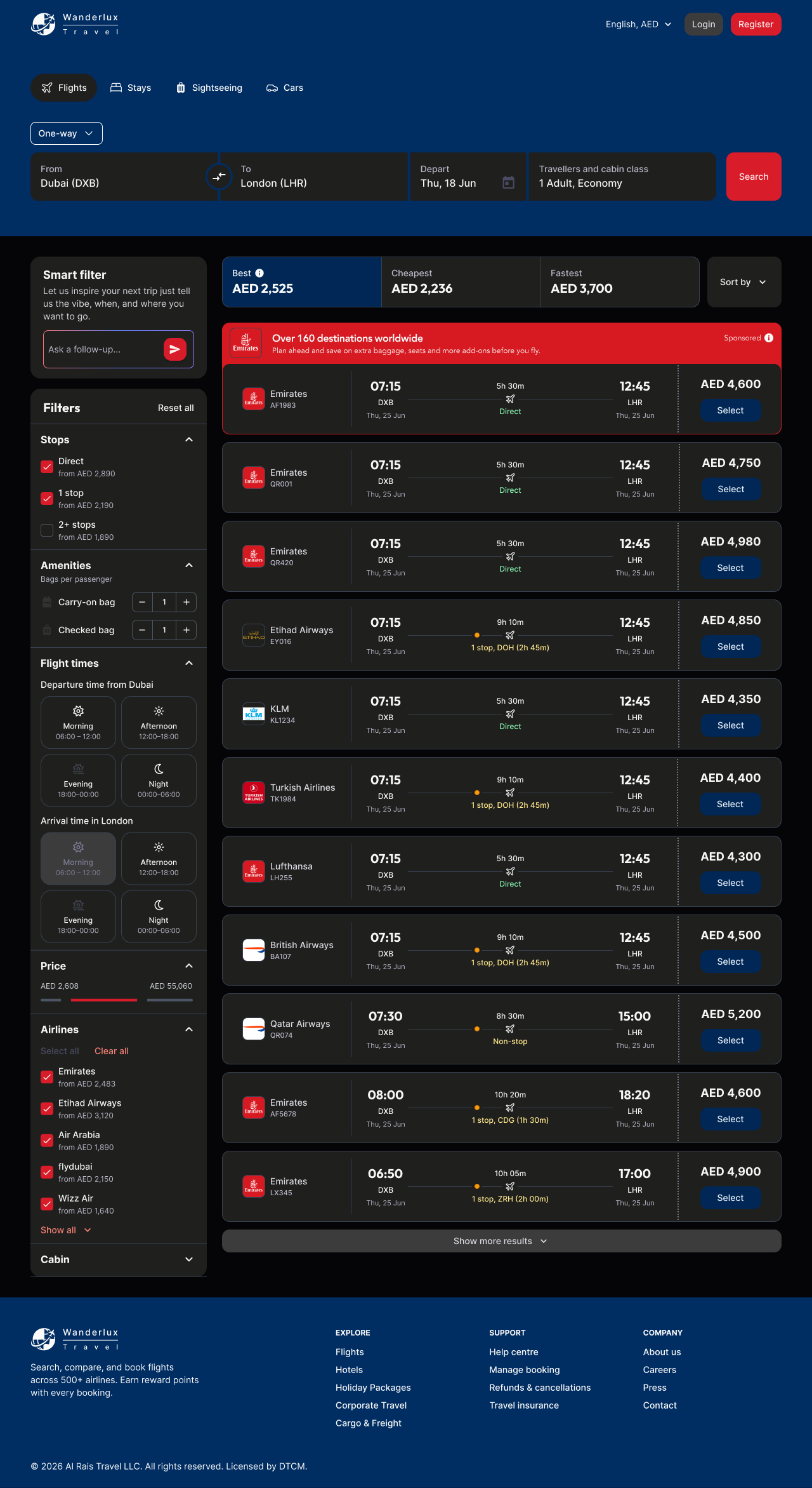
Desktop Dark Mode
1280px · browser chrome
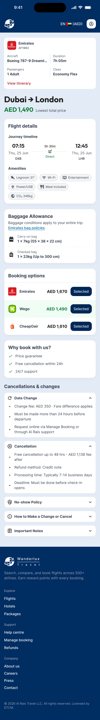
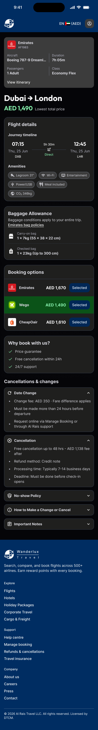
Mobile Dark Mode
390px · iPhone frame
Approach
Token-first, before touching any screen
Started with the brand token layer before opening a single frame. Extracted brand colours from the existing Wanderlux logo and defined semantic colour roles: surface, cta, canvas-light, canvas-dark. This made dark mode and responsive layouts a systematic derivation rather than manual rework.
Typography, spacing, and border radius decisions were locked into the token layer at the same time. Without this foundation first, building two modes × two viewports would have taken twice as long.
Scoping the AI feature honestly
The brief included an AI trip planning assistant (Wanderlux AI). Rather than designing a full AI product in one day, I scoped it as a surface-level entry point a search mode toggle that signals the capability without committing to a full AI conversation flow. This kept the scope honest and deliverable within the time constraint.
Annotations as part of the output
Dev-ready annotations were embedded directly in the Figma frames not added as a post-step. This meant every component, state, and spacing decision was documented as it was designed, which is only possible when working from a token foundation.
Design System Decisions
These four decisions made it possible to deliver 6 screens with two modes and two viewports in one day without sacrificing quality.
Output
6 high-fidelity screens with embedded dev annotations, delivered within the assessment window.
Component Library
Buttons 5 variants, 5 states, 3 sizes. Flight cards with direct/stop state variants. Filter panels. Destination cards. All built from the token foundation.
Responsive Coverage
Full desktop (1280px) and mobile (390px) coverage. Each screen was designed in both light and dark modes from the same component set.
Screens Delivered
Homepage with hero search + Wanderlux AI entry point
Flight search results with filter panel + flight cards
Pre-booking flight detail with fare breakdown + traveller summary
Annotations
Spacing, colour tokens, component specs, and responsive behaviour documented inline dev-ready without a separate handoff document.