
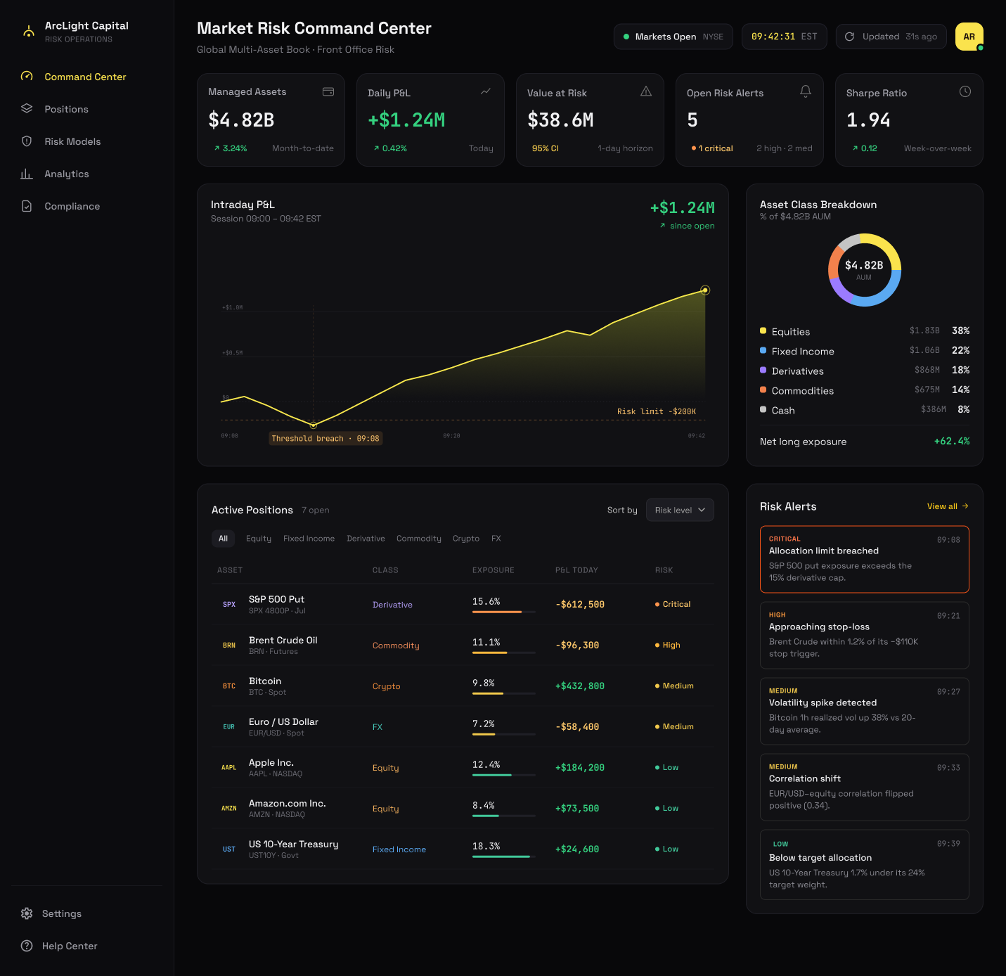
ArcLight Capital Risk Command Center
A real-time risk monitoring dashboard concept for a fictional $4.82B AUM asset management firm. The brief was self-set: make the entire portfolio state readable in under 10 seconds, with drill-down that doesn't break context.
The Problem
Design a real-time risk monitoring dashboard for a fictional asset management firm (ArcLight Capital) that handles $4.82B AUM across equities, derivatives, fixed income, commodities, crypto, and FX simultaneously.
Information Architecture
Information Hierarchy
A risk dashboard fails when it treats all information as equal the interface has to encode severity structurally, not just visually. The hierarchy was defined as three tiers: portfolio-level health (5 metric cards), pattern recognition (intraday P&L chart + asset class breakdown), and exception-driven action (alerts feed + positions table).
Semantic Colour
Colour carries semantic weight throughout every hue maps to a risk level and stays consistent across badges, exposure bars, chart fills, and alert borders. The drill-down view (position detail) was designed to feel like a continuation of the same mental model, not a context switch same sidebar, same severity system, same clock, deeper data.
Surface System
The dark theme is not aesthetic preference. High-density financial interfaces are used across long sessions under varied lighting. Dark backgrounds reduce eye fatigue, and the layered surface system stepping from near-black root through sidebar, chip overlays, and cards creates depth without borders, letting content group itself spatially.
Screens
Two high-fidelity Figma screens covering the full monitoring surface: the Command Center for portfolio-wide state, and the Position Detail for single-position drill-down.
Main dashboard: metric cards, intraday P&L chart, positions table, donut chart, alerts feed. Portfolio state readable at a glance severity encoded in structure, not just colour.
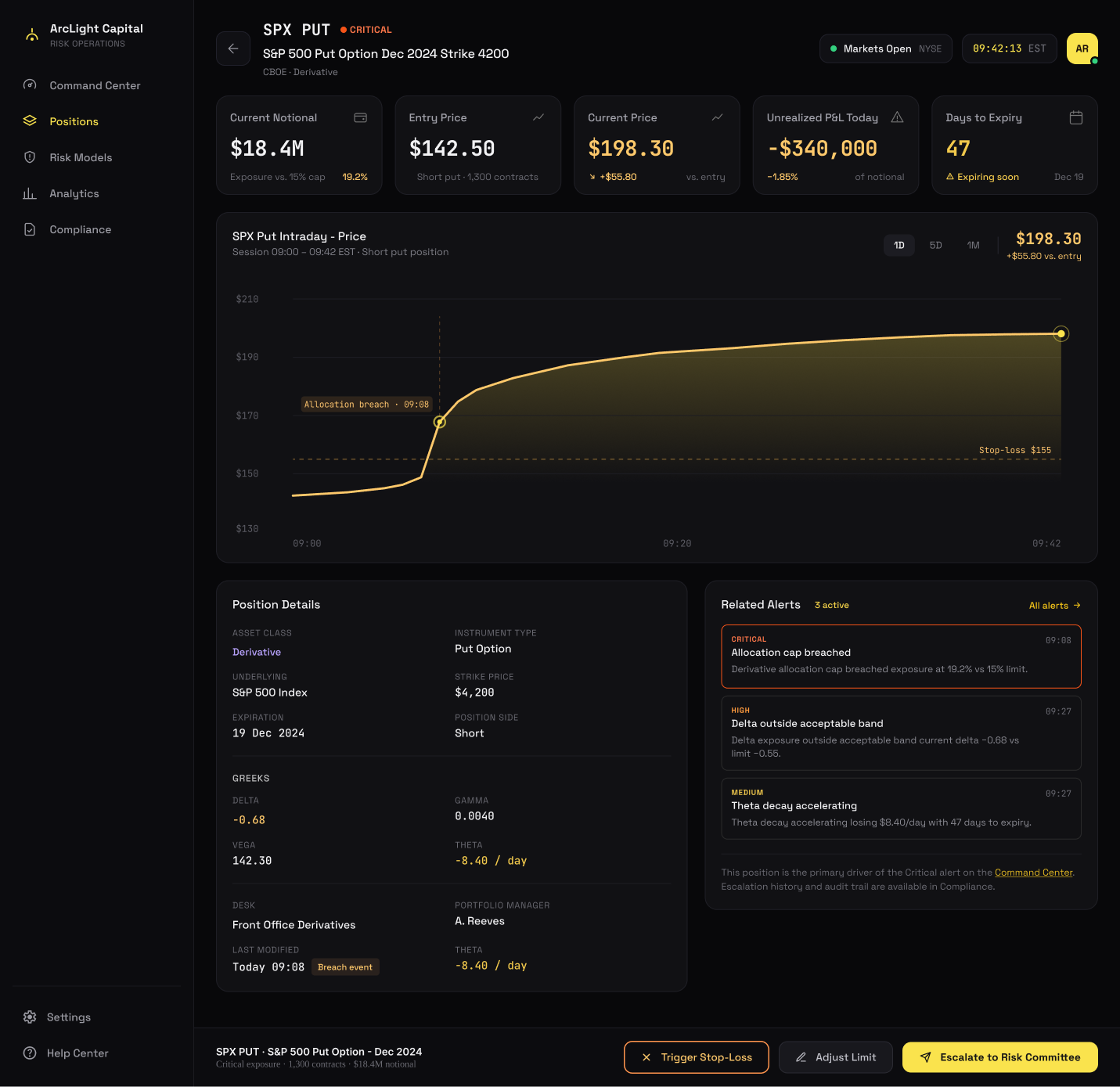
Drill-down view: position metrics, price chart, Greeks panel, related alerts, fixed action bar. Same sidebar, same severity system, same clock deeper data without a context switch.