
Modernizing Cash Collection for Egypt's Digital Economy
Egypt's corporate sector still ran on cash handoffs, no visibility, no trail, no control. Banque Misr needed a digital replacement across two platforms. I was the only designer on it.

Context

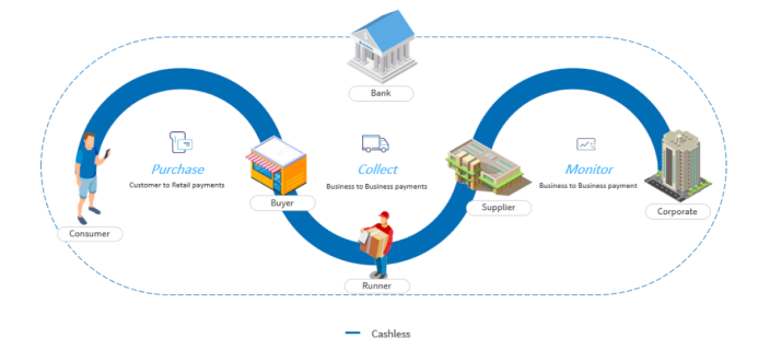
Egypt's B2B payment landscape was - and to a large extent still is - built on physical cash. Corporate distributors collect invoice payments from merchants in person, drivers carry cash across cities, and finance teams reconcile everything manually at day's end. Banque Misr, the second largest bank in Egypt with over 850 branches across the Middle East, Europe, and Asia, saw an opportunity to lead the country's shift toward digital B2B payments - and built a product to do it.
The Cash Collection System is a dual-platform digital payment ecosystem: a web dashboard for corporate distributors to initiate and track collection requests, and a mobile app for merchants to pay invoices digitally through Banque Misr's infrastructure.
The Problem
Egypt's corporate sector was losing significant revenue annually to manual cash handling - a process that created security risks for delivery drivers, reconciliation errors across large merchant networks, and zero real-time visibility into invoice collection status for finance and operations teams.
User Pain Points
· Corporates couldn't track payment status across
their merchant networks in real-time - every update required a phone call
· Merchants needed simpler, trustworthy digital payment methods
that mapped to their existing mental model of cash exchange
Business Goals
· Reduce cash handling risk and improve
operational efficiency
· Position Banque Misr as a leader in Egypt's digital payment
transformation
· Build scalable infrastructure for additional B2B use cases
Constraints
· Must integrate with existing banking infrastructure
and compliance requirements - no greenfield stack
· Must work for users with varying levels of digital literacy,
particularly among merchant segments
My Approach
I owned end-to-end design across both platforms - from field research in Egypt to final handoff specs. My approach on this project was grounded in a simple belief: you can't design trust from a desk. Understanding what makes a merchant trust a digital payment - especially in a market where cash is the default - required being in the room with them, watching how they work, and building from what we observed rather than what we assumed.
Responsibilities
· Leading concept testing and validation
research with participants across Egypt
· Facilitating cross-functional workshops to synthesize insights and
define product direction
· Designing and iterating on both the corporate web dashboard and
merchant mobile app
· Running 7 rounds of usability testing over 6 quarters - solo for
the first 4 months, then collaboratively
Timeline
18 months - 6 quarters of iterative design and testing
Team
2 Product Designers · 2 UX Researchers · Product Manager · Product Lead · 2 Product Owners · Engineering Team
Research & Discovery
Research Goals & Methods
I started by defining research goals and planning the
study approach, then gathered existing data from internal
systems to understand current workflows before touching any field research. The goal was to enter
interviews with hypotheses grounded in operational reality, not assumptions.
Methods included in-depth user interviews, contextual inquiry
(observing real cash handling processes), and shadowing sessions to
validate our two core user journeys.
Fieldwork
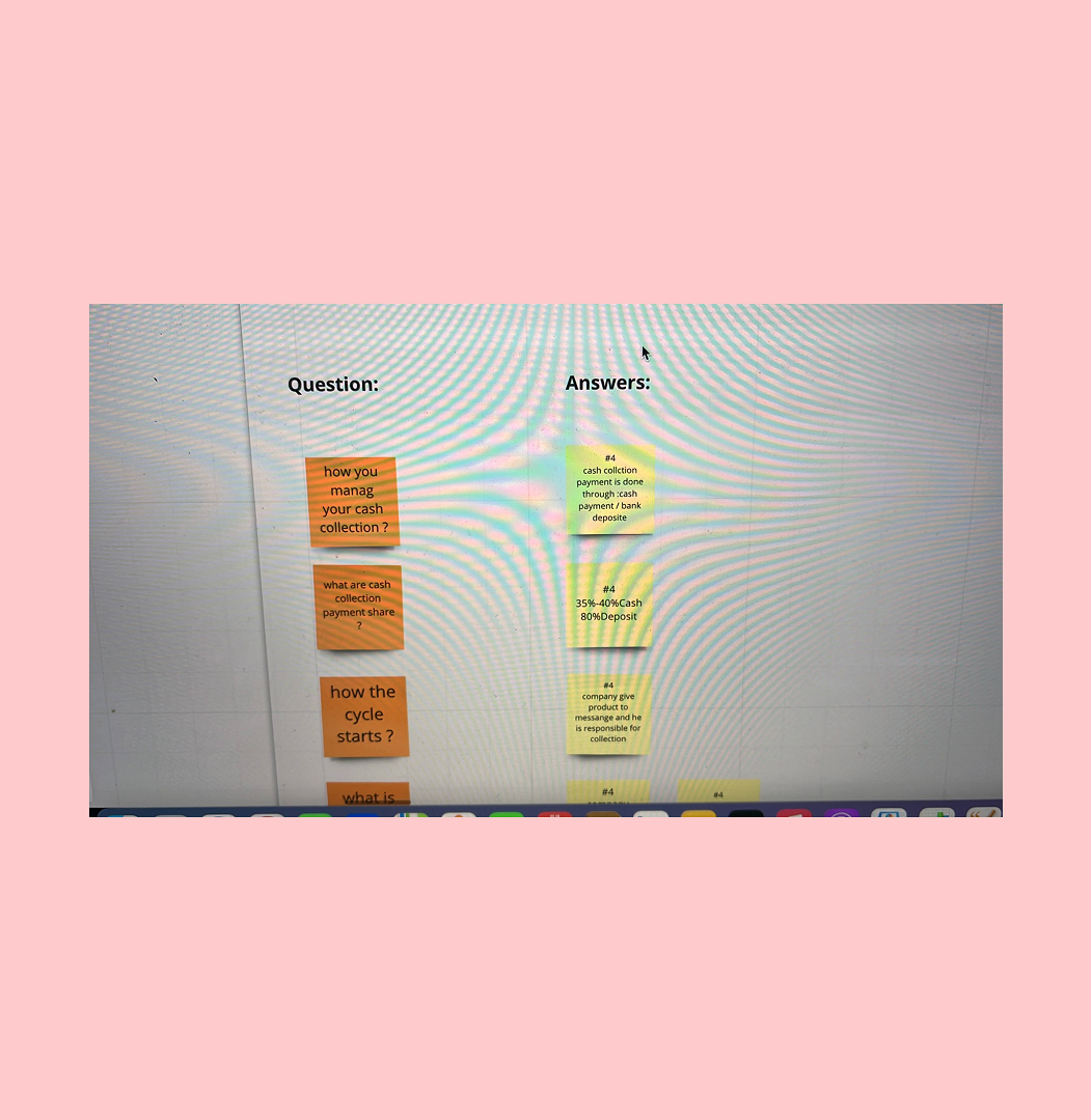
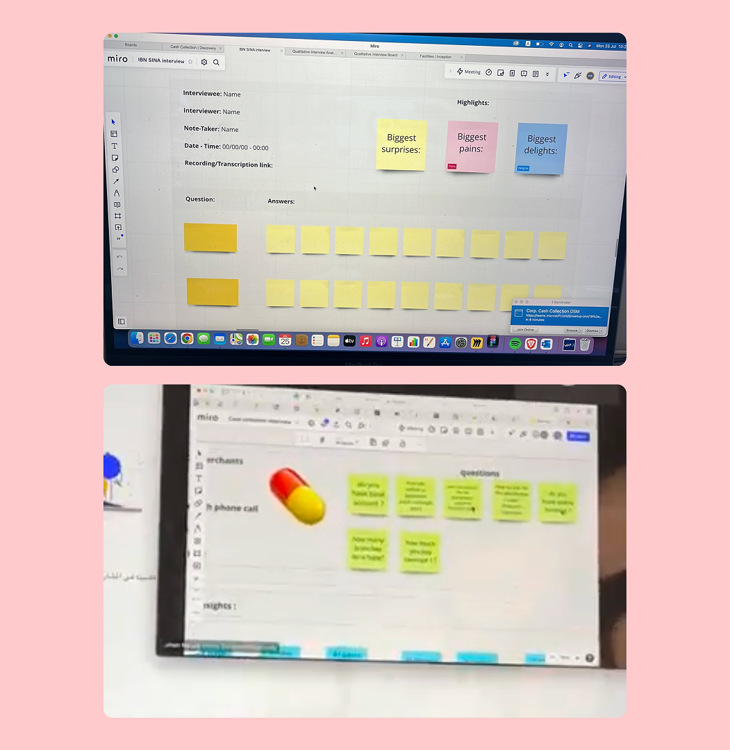
I conducted 12 in-depth interview sessions and participated in 23 shadowing sessions with both BM customers and non-BM customers - corporate users and merchants across Egypt. Recruiting participants in the field, rather than through panels, gave us access to users in their actual working context.
Synthesis
After gathering data, I built an affinity map to synthesize findings across user types. The two biggest themes that emerged: trust (merchants didn't trust digital systems with their money) and invisibility (corporates were operating blind on collection status).
Problem Definition
Problem Statements
Corporate
As a corporate user, I need to track payment collection across my merchant network so that I can manage cash flow and reduce collection delays - but currently I have no visibility into payment status and rely entirely on manual follow-ups.
Merchant
As a merchant user, I need a simple, trustworthy way to pay my distributor invoices so that I can maintain good supplier relationships - but currently I must handle cash or navigate complex bank processes that I don't understand or trust.
Design North Star - How Might We…
These HMW questions framed every design decision that followed:
1. HMW give corporates real-time visibility without requiring them to
change existing workflows?
2. HMW make digital payments feel as trustworthy as handing over cash
- especially for low-digital-literacy merchants?
3. HMW simplify the payment flow for merchants so that completing a
transaction requires no training?
Collaborative Workshops
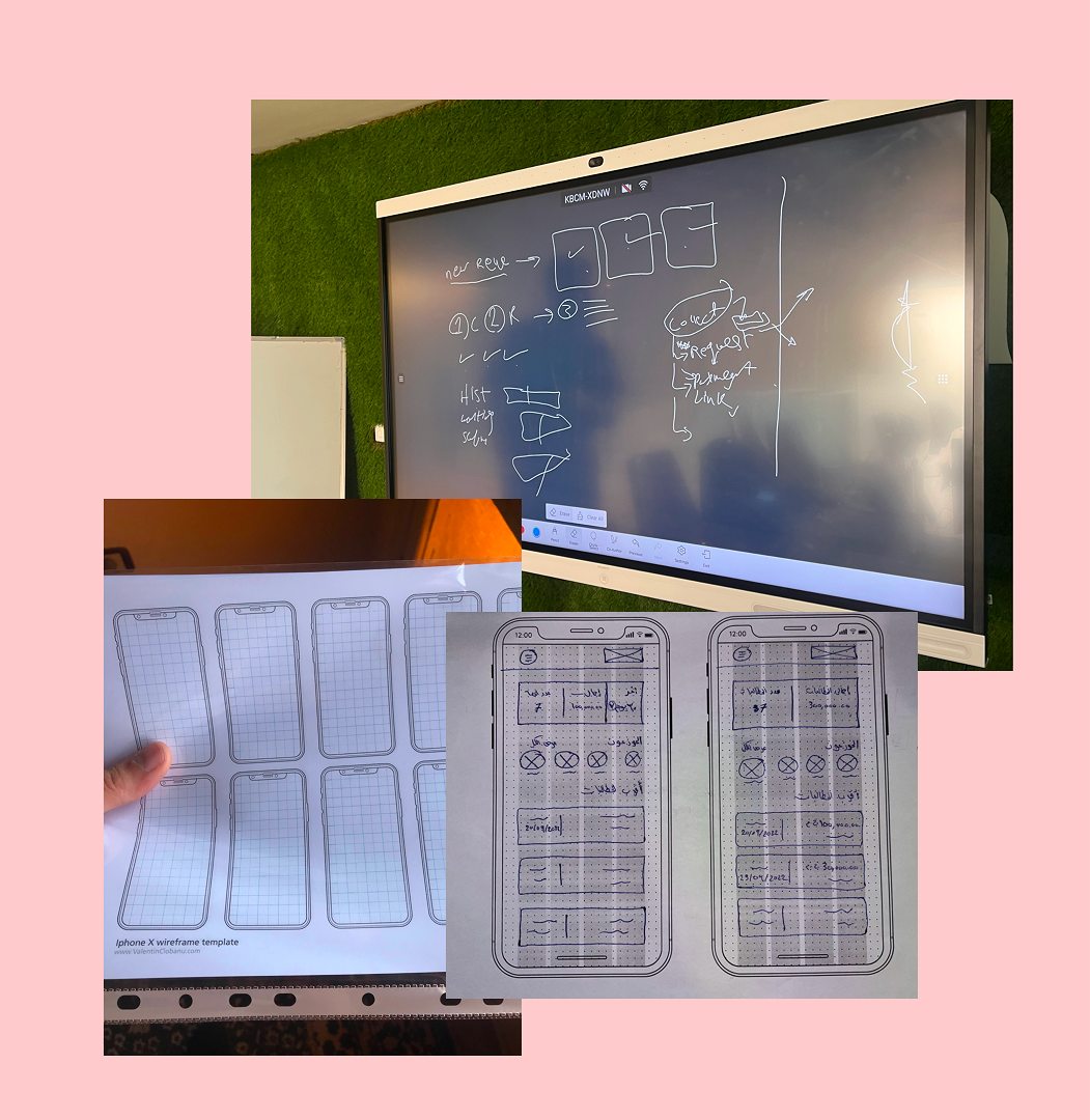
I facilitated brainstorming sessions with PMs, POs, and UX peers - open sketching, concept exploration, and structured HMW exercises. These sessions surfaced directions none of us would have reached individually and built shared ownership of the solution direction before a single pixel was placed.
Design Direction
Before moving to screens, I established the information architecture for both platforms, mapping how data and actions would flow between corporate and merchant experiences. The two products had to feel independent enough to serve radically different users while remaining tightly connected at the data layer.
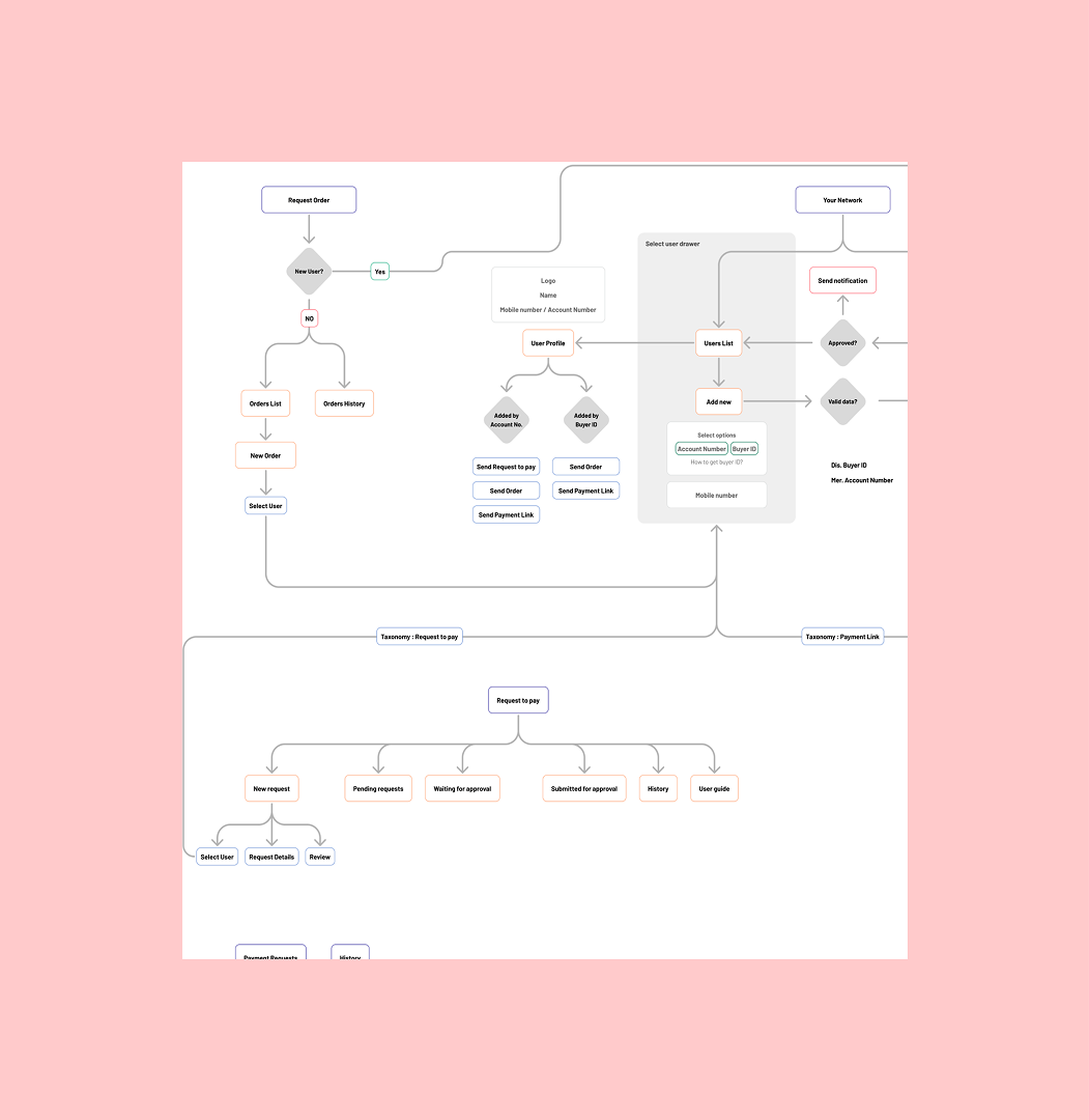
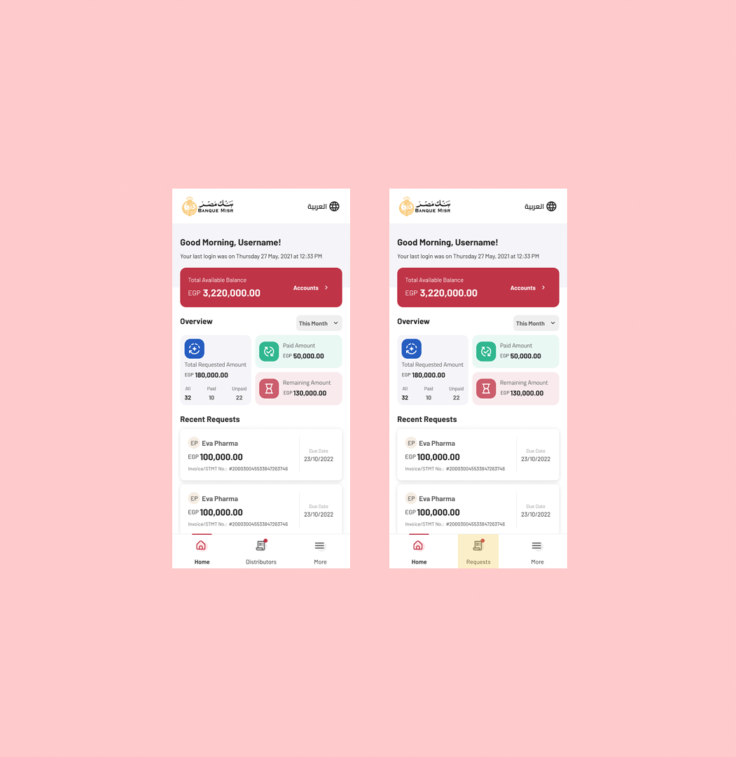
Corporate Web Dashboard
Designed for desktop, finance managers and operations leads who work across
large merchant networks. Key IA decisions: status surfaced at the list
level (not buried in detail views), bulk actions for
high-volume users, and a reporting layer that maps to existing
finance workflows.
· Dashboard overview, key metrics and recent activity
· Merchant management, add, edit, view relationships
· Payment Request creation and management
· Payment tracking and reporting
Merchant Mobile App
Designed for mobile, merchants who primarily interact through WhatsApp and basic
smartphone apps. Key IA decisions: home screen = actionable items
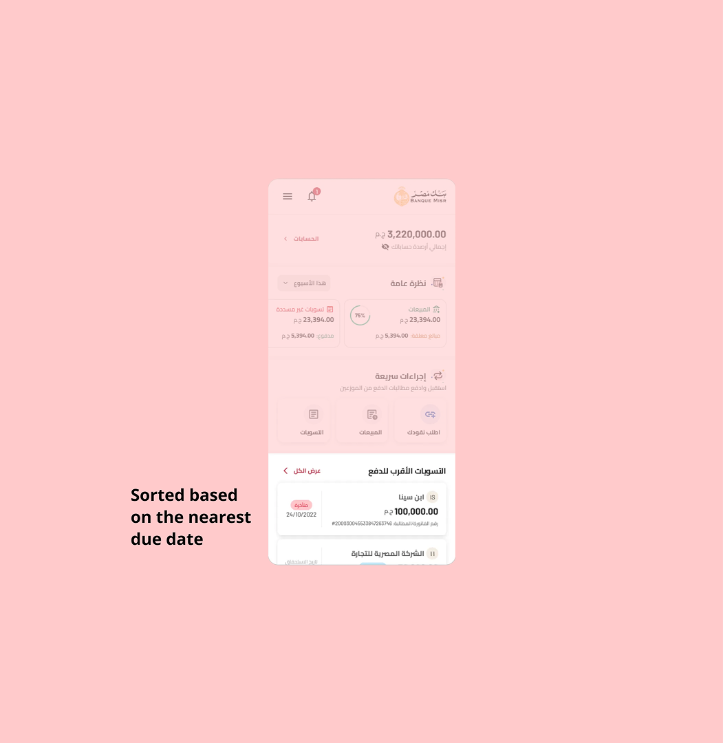
only, requests sorted by due date by default, payment flow designed to require zero prior digital banking knowledge.
· Home screen, pending requests, sorted by due date
· Request details and payment flow
· Payment confirmation and receipt
· Transaction history
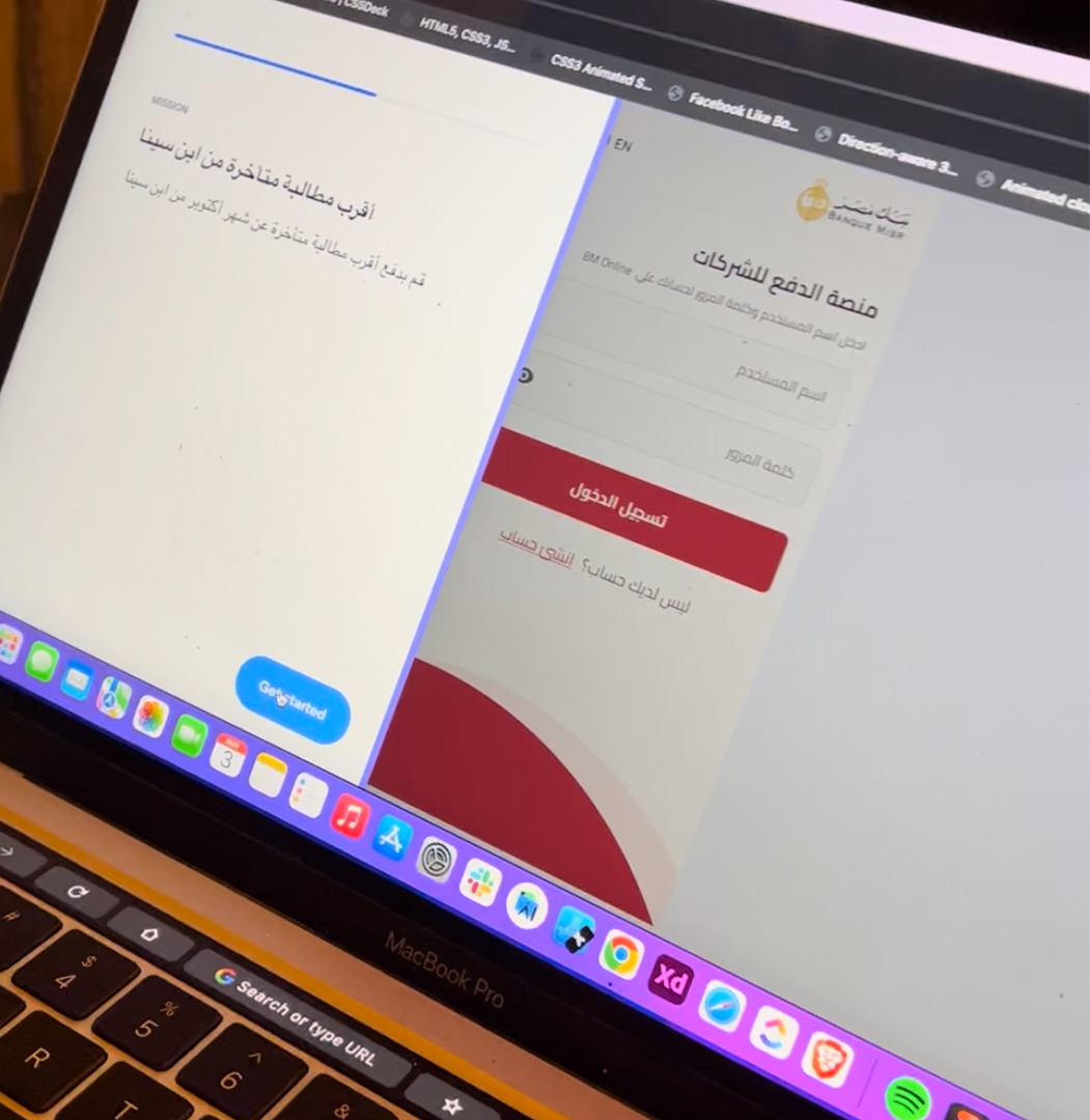
Prototyping
Using the design system components allowed me to move from sketches directly to high-fidelity interactive prototypes, cutting the wireframe phase and putting something real in front of users faster. Each prototype was built to test a specific hypothesis, not just to show screens.
What Each Round Was Testing
Early rounds tested the core mental model:
would merchants understand that paying an invoice was their action, not a bank-initiated debit? Would
corporate users trust a status dashboard over a phone call?
Mid-cycle rounds focused on navigation clarity and request discovery,
could users find what they needed without guidance? Later rounds stress-tested edge cases: zero-state screens, error recovery, partial payment
scenarios, and sessions with users who had limited smartphone experience.
Testing & Iteration
I ran 7 rounds of usability testing across 6 quarters - 1 to 2 rounds per quarter. In early rounds I managed everything: participant recruitment in the field, session facilitation, note-taking, and analysis. As the team scaled, I focused on the merchant app while collaborating on corporate dashboard findings.
Reporting & Recommendations
After each round I produced a structured testing report summarizing observed behaviors, severity-ranked issues, and recommended design responses. These reports became the input for the next design iteration and were shared with the full product team to maintain alignment across engineering and product ownership.
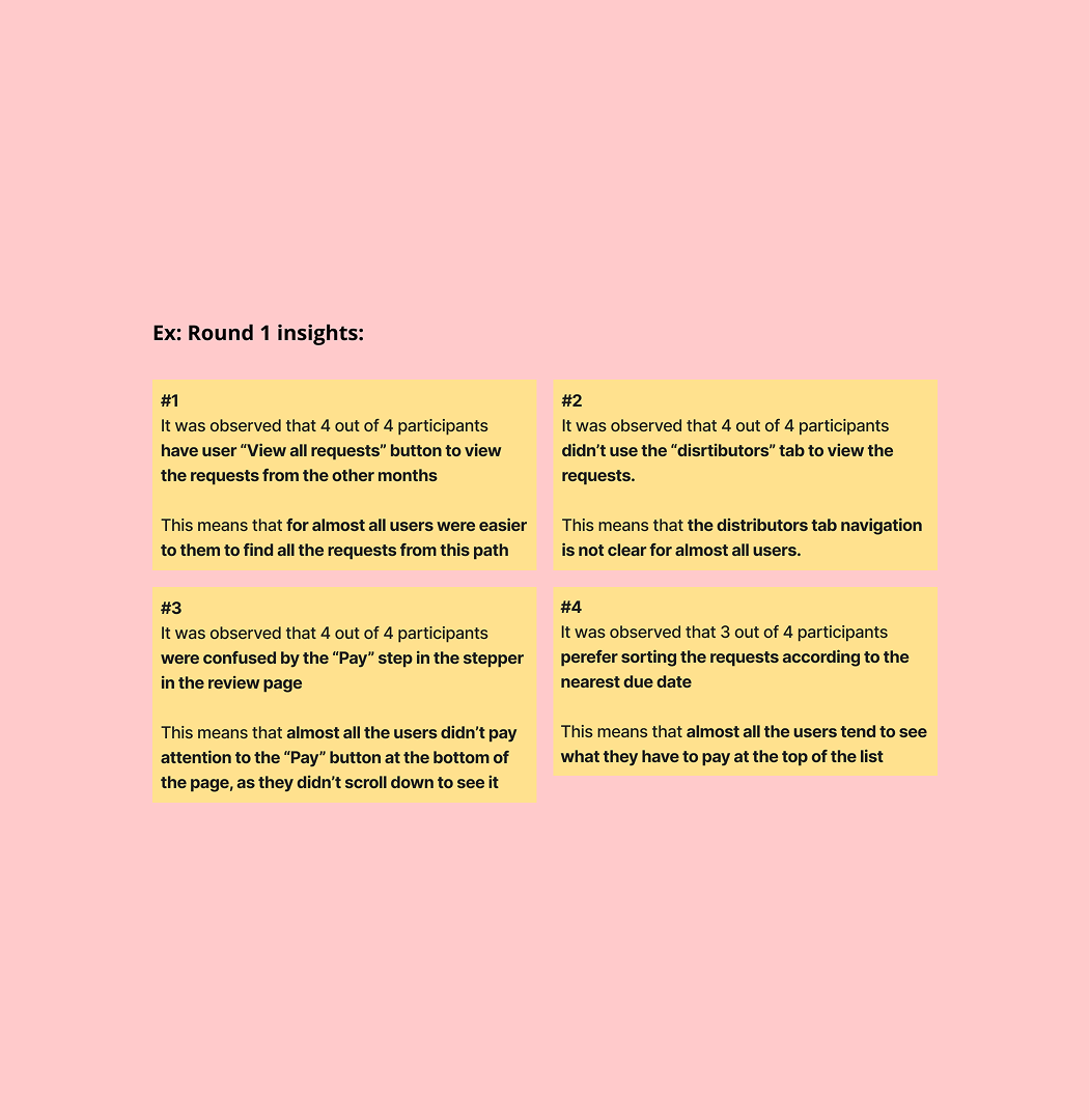
Design Refinements: Insights That Changed the Product
These three findings from the usability rounds each triggered a concrete design change. The pattern is the same in every case: observed behavior → insight → decision → implementation.
Rename the "Distributors" tab → "Requests"
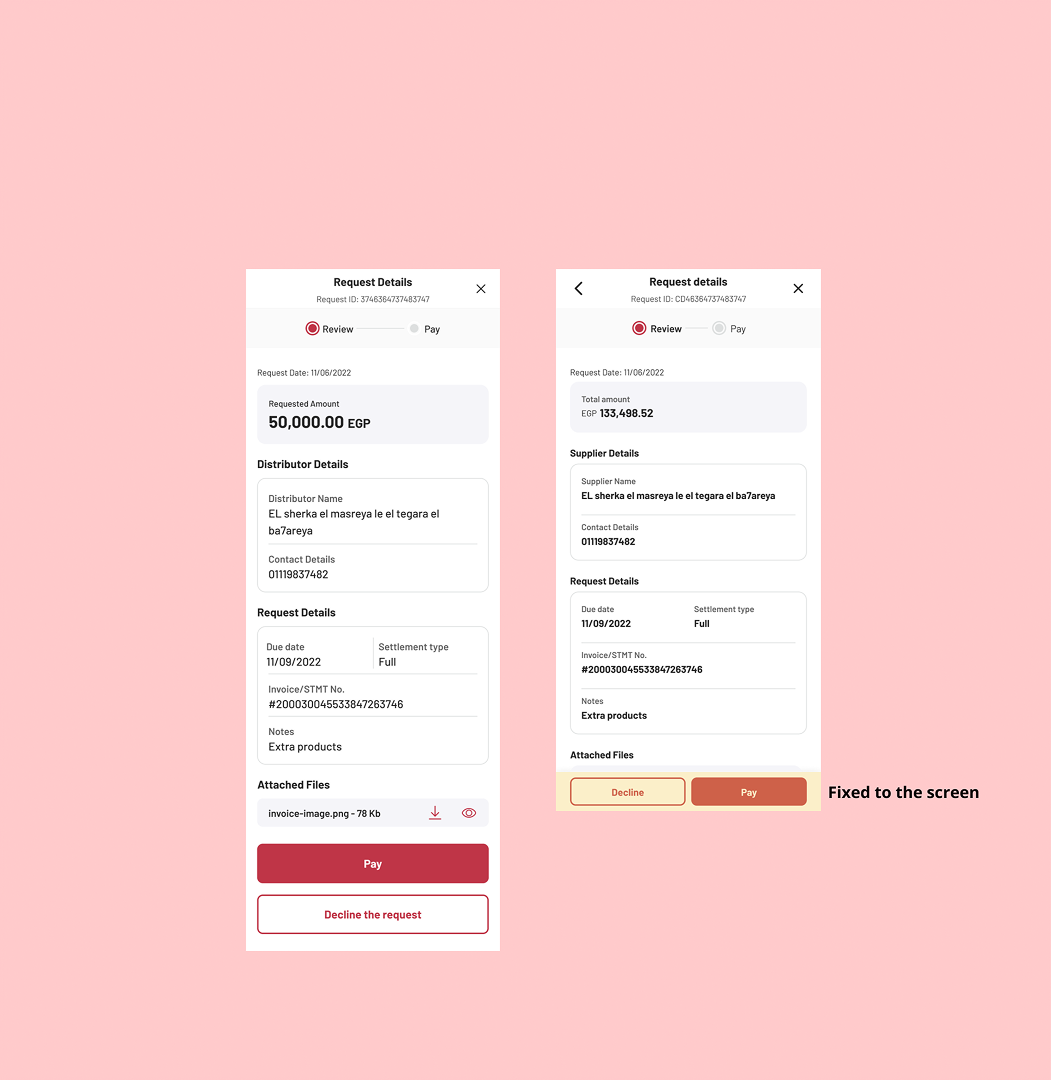
Fix the payment CTA to the screen
Sort requests by nearest due date by default
Final Design
Corporate Web Dashboard
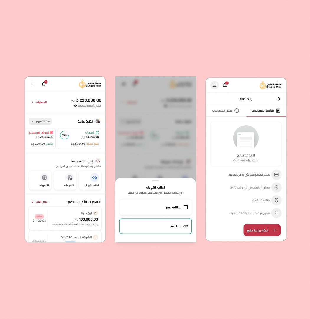
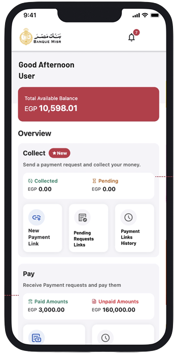
Real-Time Collection Dashboard
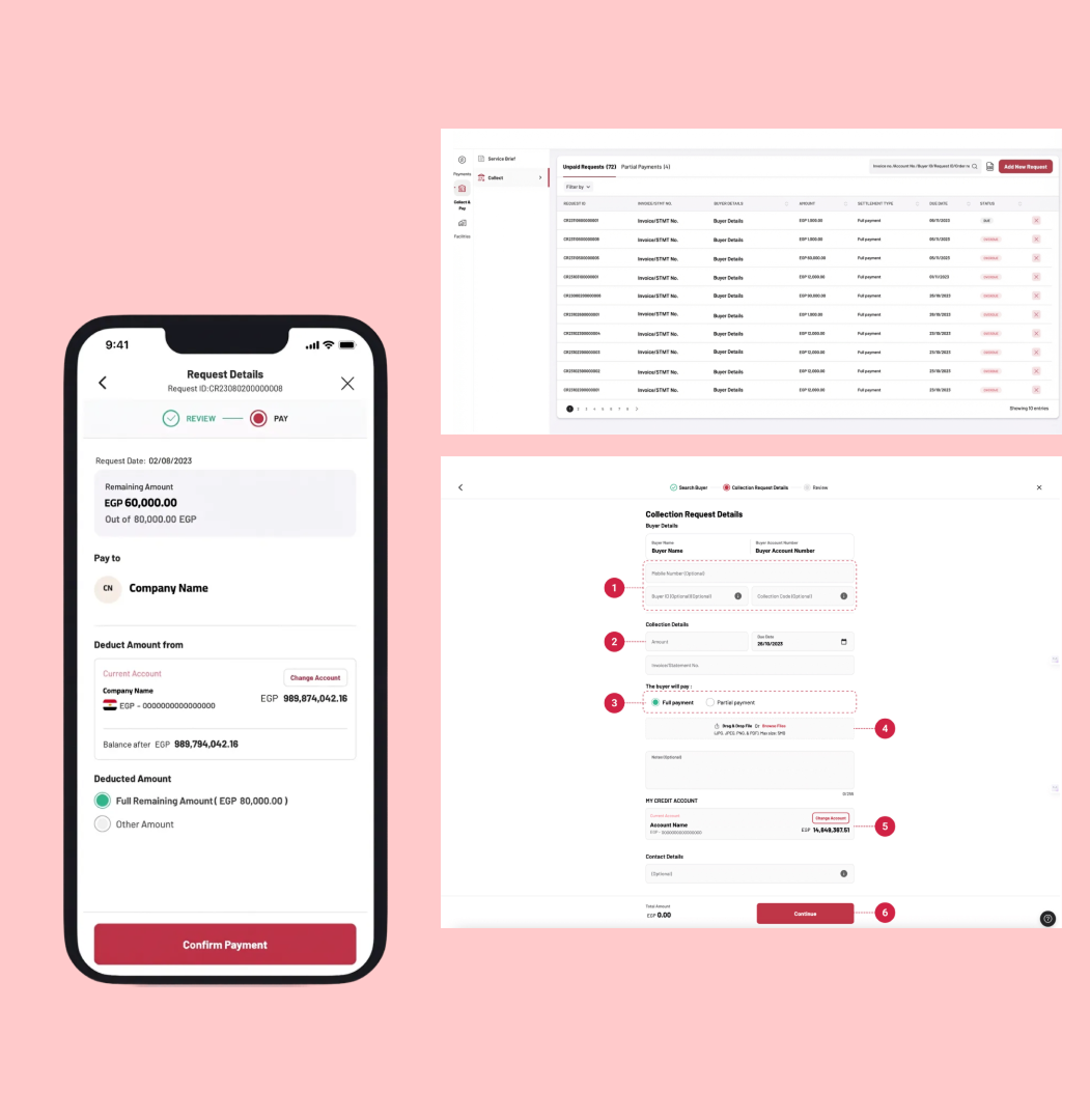
The key design decision was surfacing payment status at the list level, not buried in detail views. Corporate users see the state of every request inline: pending, in-progress, paid. The dashboard becomes a control room without requiring any drill-down for the daily status check that previously needed a phone call.
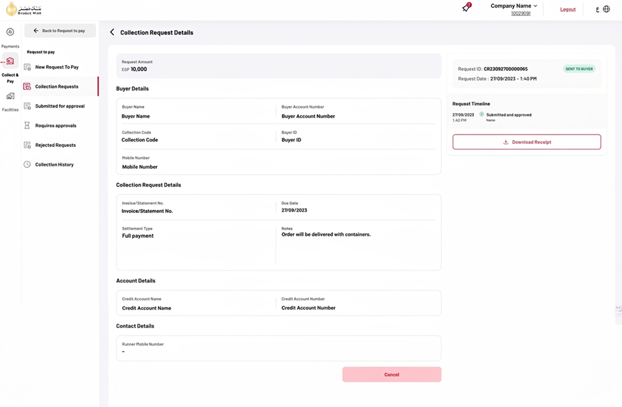
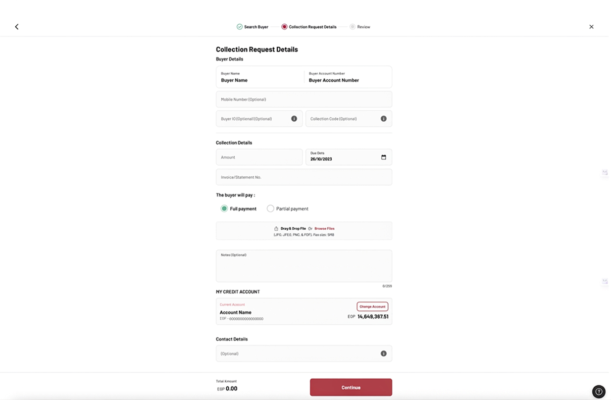
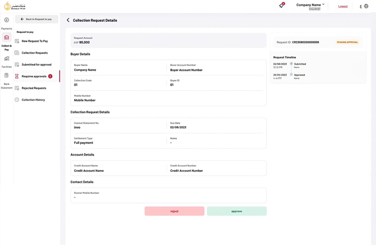
Request Management
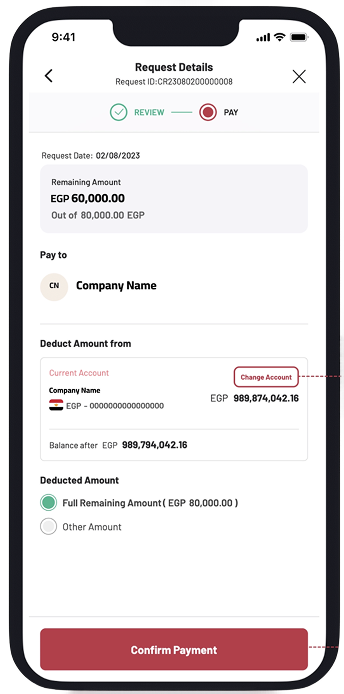
Designed around a recurring reality: a corporate distributor managing 40-200 merchant relationships. The creation flow uses a 3-step stepper (Search Buyer → Request Details → Review) to break a complex form into manageable stages. The approval workflow surfaces pending items with a dedicated sidebar state and inline approve/reject actions, keeping the review action one click away.
Merchant Mobile App
Merchant Payment Flow
Early testing showed a 5-step flow caused drop-off at step 3. The final design reduces the critical path to 3 steps. The home screen separates the Collect and Pay contexts clearly so merchants land on the right action immediately. The bank selection step was removed by defaulting to Banque Misr, making the override an advanced option, not a required decision. The persistent Confirm Payment CTA fixed to the footer (Insight #3) ensures the action is never hidden by scroll.
Handoff & Launch
Developer Collaboration
I created comprehensive design specifications for both platforms, documenting every interaction state, edge case, and responsive behavior. Beyond the spec file, I established a design QA process with engineering, regular check-ins during development sprints where I reviewed implementation against design intent and logged enhancement tickets for gaps before launch.
Pre-Launch Analytics
Before launch, I ran an event tracking workshop with the product team to define what we would measure and why. The goal was to ensure that post-launch data would be actionable -not just collected- and that we could connect user behavior signals back to the design decisions made during the project.
Reflections
What Worked
Field Research Over Desk Research
Recruiting and interviewing participants in context -not through panels- surfaced the trust dynamic with cash that no survey would have revealed. The insight that merchants needed digital payments to feel like a social exchange, not a banking transaction, came entirely from watching real handoffs happen.
Cross-Functional Workshops
The HMW sessions with researchers, PMs, and engineers consistently produced directions none of us would have found alone. More importantly, they built shared ownership, which meant fewer design-development conflicts during sprints because the team had been part of defining the direction.
Challenges
· Operating as sole designer for 4 months
stretched my capacity across research, design, and facilitation simultaneously. I overcame this by
ruthlessly prioritizing, choosing depth over breadth in each sprint and being transparent with
stakeholders about what was being deferred and why.
· Designing for two fundamentally different users on the same product
cycle required constant context-switching and discipline not to let corporate-centric thinking bleed into
merchant flows, or vice versa.
Key Learnings
1. Resilience is a design skill. Four months as
the sole designer on a dual-platform product taught me that maintaining quality under pressure requires
systems, prioritization frameworks, clear sprint scope, and stakeholder communication, not just
effort.
2. Timing and framing of research questions matter as much as the questions
themselves. Early sessions used open-ended discovery questions to uncover mental models. Later
rounds used task-based scenarios to test specific hypotheses. Mixing these too early in the process
produces noise; structuring the progression deliberately produces decisions you can stand behind.
What I'd Do Differently
I would have invested more time upfront designing for low digital literacy. A significant segment of Egyptian merchants have limited reading ability or minimal smartphone experience, and while the design addressed this in broad strokes, it deserved dedicated research and alternative interaction patterns, visual-first navigation, guided first-run experiences, illustrated micro-instructions. The product works for digitally-capable merchants. It could serve everyone.