
Rebuilding Design Consistency at Scale
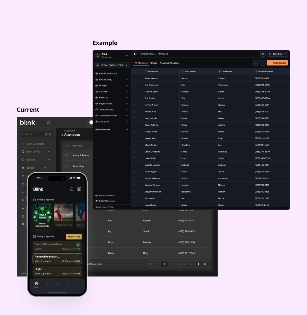
The team had lost trust in the design system. Files were so bloated designers avoided opening them. Brand switching took 8 weeks. I had to rebuild it, without stopping live work.

Anatomy of a Scalable Component
A robust design system component adapts to different contexts through defined properties, maintaining its core DNA while offering flexibility. Try toggling the properties below.
The Challenge
1. Severe Inconsistency
There was no single source of truth, leading to countless duplicated and detached components (e.g., dozens of different buttons).
3. Development Friction
The handoff to developers was chaotic, resulting in implementation discrepancies, constant rework, and shipped products with bugs and visual inconsistencies.
2. Major Inefficiency
Design files were slow and bloated, and the intended token system was unused, making the process of rebranding for clients extremely slow (1-2 months).
Discovery & Research
1. Stakeholder interviews
Research revealed pain points across teams:
- Designers: struggled with inefficient files and inconsistent
components
- Developers: lacked clear specifications
- Product managers: faced delays and inconsistent quality.
3. Competitive Analysis
Researched how other companies handled similar multi-product, white-label
scenarios
Studied design system governance models from industry leaders
2. System Audit
- Analyzed existing design files and component libraries
- Documented current handoff processes
- Mapped brand switching workflows
- Identified most commonly used and duplicated components
Key Insights
- Trust was broken - The team had lost confidence in the design system
- No clear ownership - System maintenance was everyone's and no one's responsibility
- Parallel work streams needed - We couldn't
stop all work to rebuild everything
- Governance was missing - No processes for
requesting, reviewing, or implementing changes
Strategic Approach
The Rebuild Strategy: Rather than attempting to fix the existing system (which had failed), I proposed a parallel implementation strategy
Phase 1: Foundation Building
Build new design system from scratch alongside existing work
Announce completed components for immediate use in new designs
Maintain existing designs until refactor opportunities arose
Phase 2: Pilot Implementation
I leveraged the development of a new
product (Product X) as a strategic opportunity
By using it as a testing ground to:
Prove the system's value and build team confidence.
Refine processes based on real-world usage
Phase 3: System Expansion
Roll out successful patterns to existing products
Establish governance model
Scale team involvement and ownership

Getting Buy-In
- The key to success was building trust through small wins:
- Started with foundational elements (colors, typography, spacing)
- Demonstrated clear improvements in file performance and consistency
- Involved team members in decision-making process
- Maintained transparency about challenges and progress
Design System Architecture
I implemented an atomic design methodology with clear hierarchies
Design Tokens
- Rebuilt token structure for better coherence
and scalability
- Semantic naming conventions (interactive/background/primary/standard, surface/contextual/canvas)
- Brand-agnostic base tokens with brand-specific overlays
- Reduced brand switching time from 4-8 weeks to days

The token architecture behind this system goes deeper than what's covered here, including the 3-layer model (primitives, semantics, components), naming conventions, and how it enabled dark mode across 6 products with zero component-level changes. Read the dedicated tokens case study →
Component Library Structure
Atoms: Basic elements (buttons, inputs,
icons)
Molecules: Simple combinations (search bars, card headers)
Organisms: Complex interface sections (navigation, product cards)
Templates: Layout structures and page frameworks


Governance & Collaboration
Hybrid Governance Model: The hybrid model combines a federated and centralized approach for managing a design system. In this structure:
Advantages: This model offers a balance between
centralized control and distributed autonomy
Consideration: Its success depends on clearly defining the balance of
control and freedom, requiring strong communication and guidelines to ensure consistency.
Component Request Process
Streamlined Component Request Workflow To maintain system integrity while enabling
team autonomy, I developed a comprehensive decision-tree workflow that guides teams through component
requests:
Initial Assessment: Teams evaluate whether existing components meet their
needs before requesting new ones
Requirements Validation: Clear criteria determine whether modifications to
existing components or entirely new elements are needed
Reusability Evaluation: Components must demonstrate potential for
cross-product usage to justify inclusion in the core system
Collaborative Review: Multi-stage review process involving design system
team, product teams, and development to ensure feasibility and consistency
Quality Assurance: Systematic testing for structure, naming conventions,
token usage, responsive behavior, and accessibility compliance

Naming Conventions & Guidelines
standardized rules and documentation for components and tokens, covering their naming, properties, usage guidelines, and code handoff specifications
Team Involvement
included weekly design system reviews, clear component contribution guidelines, cross-team collaboration protocols, and regular feedback-driven iterations.
Examples from the System
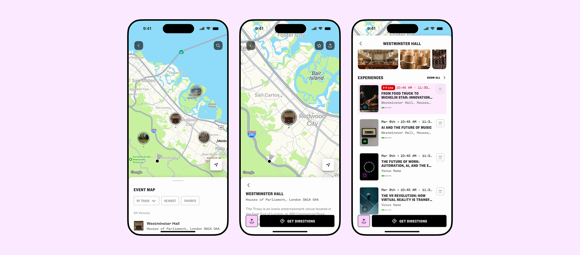
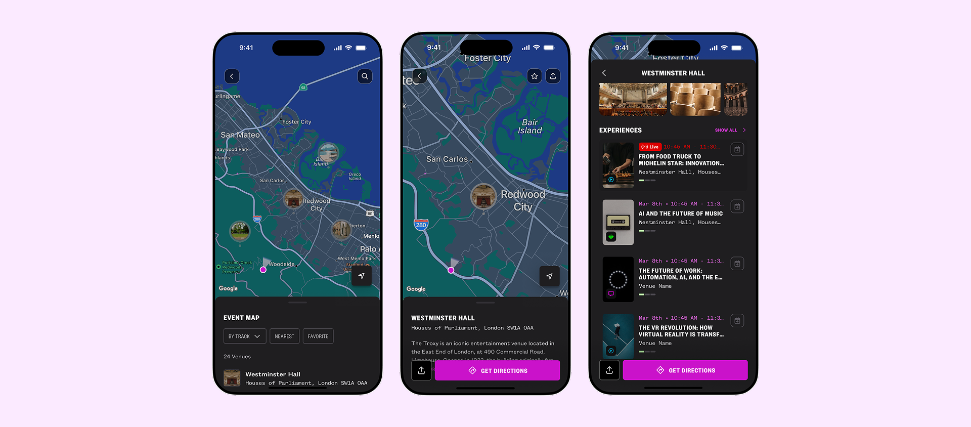
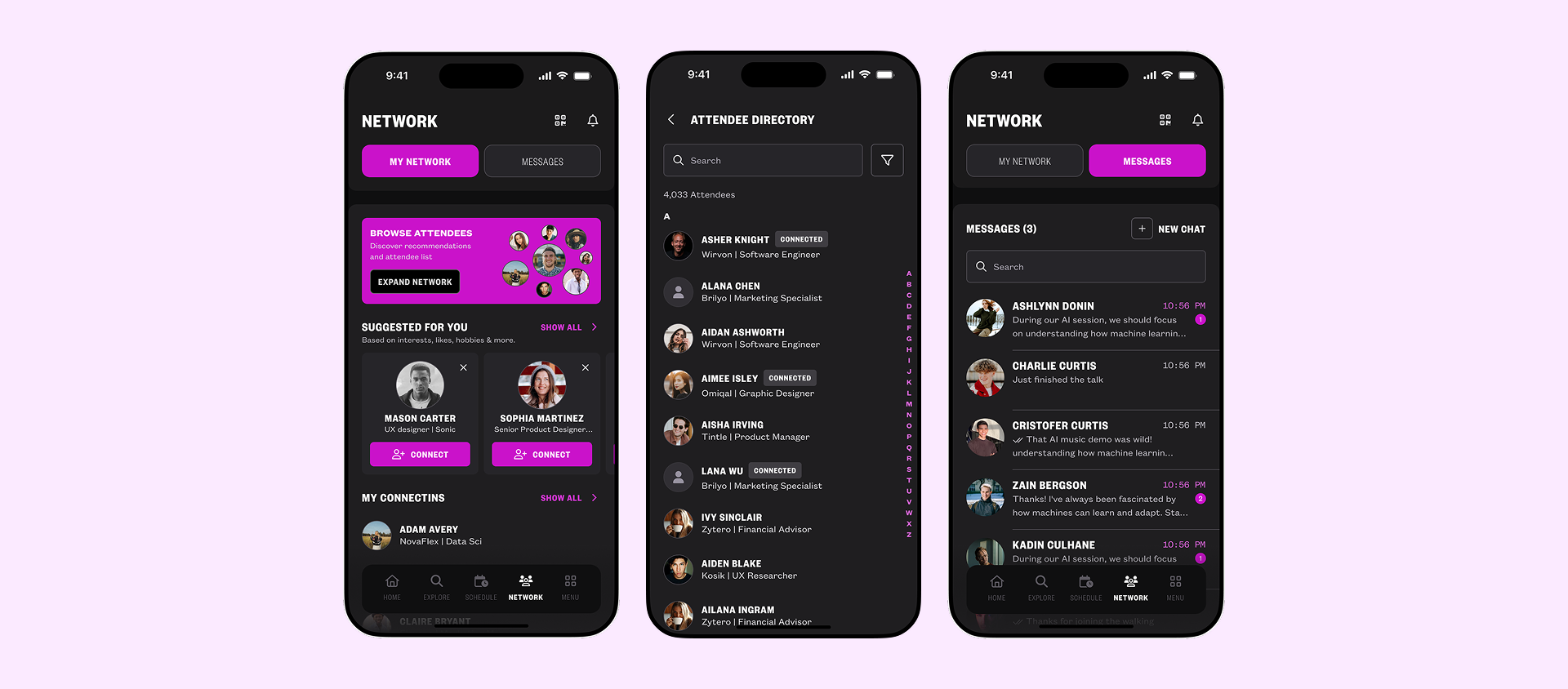
Real product screens built using the design system, showcasing consistent components, tokens, and responsive behaviour across light and dark modes
Schedule Builder
A central hub to help users find sessions, and manage agenda
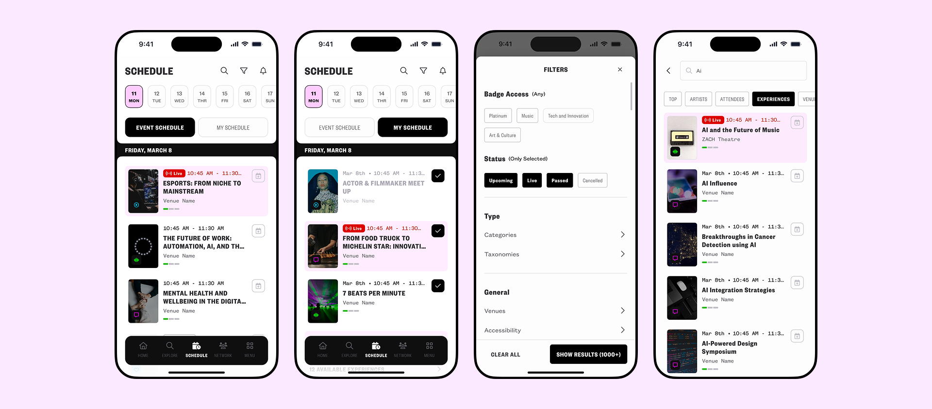
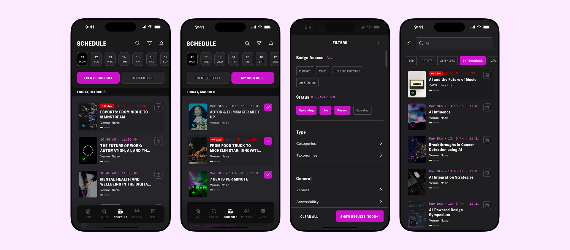
Venue Navigation
Navigate complex venues with confidence
Networking Hub
Discover and connect with relevant attendees
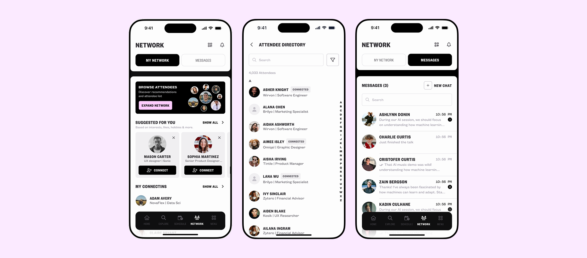
Driving Adoption
Building the system was the easier half. Getting a team that had lost trust in the previous system to actually use it was the real work.
I ran weekly design crits where new components were reviewed before being added, this gave the team visibility and a voice, which rebuilt confidence faster than any announcement could. I wrote an internal contribution guide so designers knew exactly how to request, propose, and ship changes without coming to me first.
Within the first month, two other designers had contributed components independently. By the end of the quarter, the system had 98% adoption across the team and had been piloted on a new product from day one, no legacy debt, no detached components.
Impact & Results
Quantifiable Improvements
Adoption Metrics
The new product achieved over 95% design system adoption, 98% token implementation across designs, and zero detached components.
Operational Efficiency
Brand switching cut from 4-8 weeks to 3–5 days, faster design files, developer queries down, and feature delivery 60% quicker
6 Platforms Design System Adoption
Org-Wide Adoption
Following the SXSW London delivery, the design system was adopted org-wide, scaling beyond the initial product to 6 platforms. The SXSW app proved the system could support high-stakes, high-visibility delivery under real-world conditions, making the case for full adoption across the organisation. The system was extended to cover mobile app, responsive mobile web, and desktop, a single token and component foundation powering consistent experiences across every surface.
Qualitative Impact
Team Experience
Gained confidence through reliable, consistent components that streamlined
their workflow.
Experienced less confusion and faster implementation.
Cross-team communication became smoother, stronger alignment.
Overall team satisfaction and motivation increased, creating a more positive work environment.
Product Quality
Delivered unified user experiences
across all products.
Reduced visual bugs and implementation errors through components.
Enabled faster client onboarding with dependable brand
customization.
Improved compliance across products, ensuring more inclusive
experiences.
Scaling Success
Product X's (the new product) success sparked
expansion to other products.
Product A&B products reached 35%+ adoption in new
features. 2x per-feature delivery time
Product C and Product D began systematic design system integration.
New team members ramped up faster with clear guidelines.
Reflection & Future Evolution

Key Learnings
Change Management is Critical
- Building trust through small wins
was
more valuable than technical perfection
- Team involvement in the process created ownership and
advocacy
- Parallel implementation reduced risk while proving value
Governance Enables Scale
- Clear processes prevent system
degradation over time
- Cross-functional collaboration improves both design and development outcomes
- Documentation and guidelines are as important as the components
themselves
Atomic Design Works for Complex Products
- Systematic approach to component hierarchy improved consistency
- Easier maintenance and updates across multiple products
- Clear mental model for team members to follow
Future Improvements
Technical Evolution
- Integrate accessibility testing into component development process
Process Refinement
- Develop metrics dashboard for ongoing system
health monitoring
- Create advanced training programs for new team members
- Establish design system contribution recognition and career
paths
Scale Preparation
- Plan for international localization
and RTL language support
- Develop advanced customization capabilities for complex client
needs
Related Case Study
Design Tokens: From Theory to System →
The design tokens were the foundation everything else was built on. A deep dive into the 3-layer token architecture, how primitives, semantics, and component tokens were designed, named, and rolled out across 6 products to enable rebranding in days and dark mode at scale.