
SXSW London Mobile App
SXSW London brought 1,500+ events across 79 venues to a first-time audience. I led the end-to-end design of the official mobile app, from discovery through launch.
Introduction
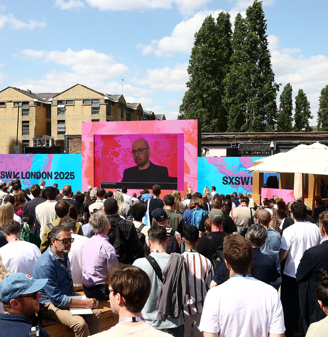
SXSW London 2025 marked the first European edition of SXSW, following its origins in Austin and expansion to Sydney. The festival brought together technology, music, film, and culture across the city through hundreds of sessions, performances, and experiences.
Behind the scenes, the event required coordinating thousands of attendees, multiple venues, live program changes, ticketing, access, and communication through a single connected experience.
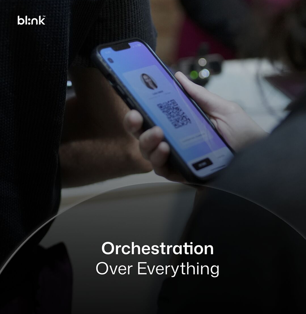
Blink's goal was to transform a fragmented event ecosystem into a scalable platform that could orchestrate every touchpoint; from registration and access to content discovery and attendee engagement.
My Role
Senior Product Designer. Owned end-to-end design for SXSW London, from research through delivery. Led 2 designers while coordinating with product, engineering, and stakeholders.
Team
2 Product Designers · Product Manager · Product Owner · Engineering Team
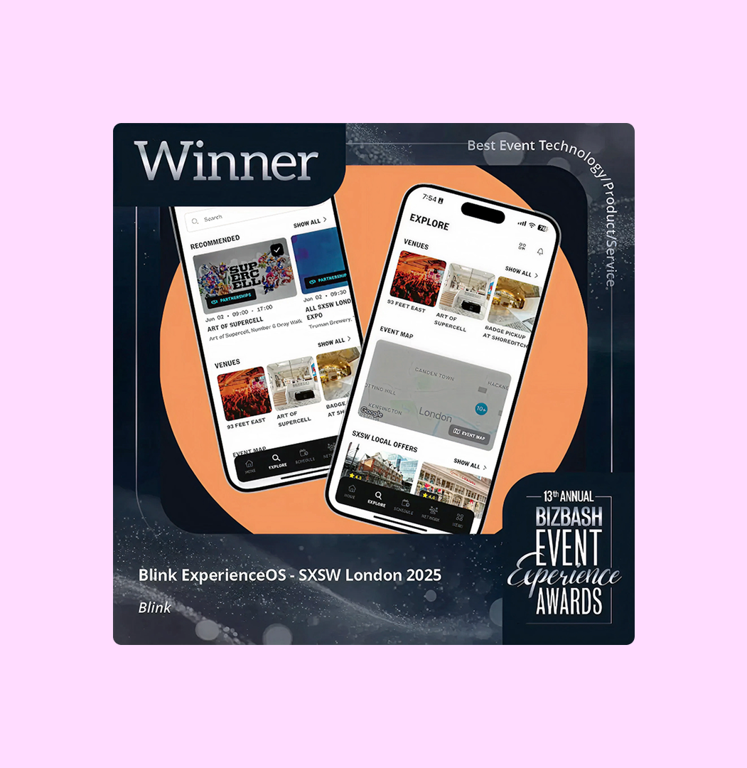
Best Event Technology/Product/Service Experience Awards 🏆
Event Experience Awards, global recognition for the platform's attendee experience quality.
The Challenge
Create an experience that could handle thousands of attendees navigating a busy city, planning personalized schedules, and connecting with other attendees, while also building a platform that future clients could completely rebrand without redesigning the product from scratch.
The Constraints
Fixed Launch Deadline
SXSW London was a live event with no option to delay.
Existing Design Debt
The previous platform lacked a scalable component foundation.
White-Label Requirements
The experience needed to adapt to different event brands without rebuilding.
Changing Requirements
The product evolved continuously as event requirements became clearer.
Discovery & Research
The Knowledge Gap
This was SXSW London's first year, and I had no prior knowledge of the SXSW ecosystem. Before designing anything, I needed to deeply understand what makes these events unique and valuable to attendees.
Secondary Research
Desk Research:
Analyzed SXSW Austin and Sydney event structures, programs, and
audience behaviors
Reviewed published statistics and demographic data spanning multiple years
Studied attendee-generated content including vlogs, social media posts, and reviews
Competitive Analysis
Mapped feature sets across different event apps to identify core functionality
Identified successful UI patterns and engagement strategies from similar large-scale
platforms
Primary Research
Conducted targeted user interviews with past SXSW attendees from
Austin and Sydney
Created a hypothetical user personas based on behavioral patterns and motivations
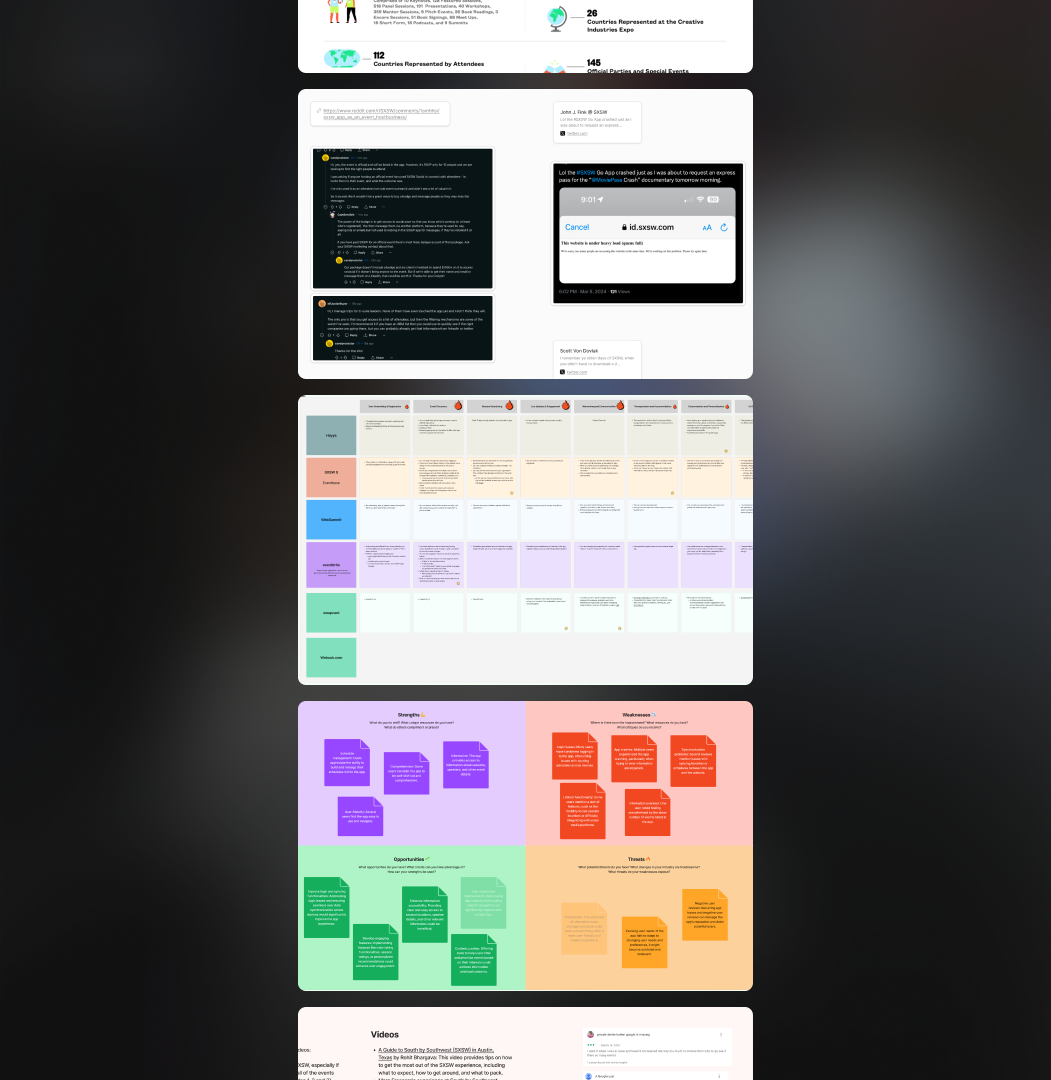
Research Synthesis: What the Research Changed
Three findings from research that directly shifted our design direction:
- In motion, not at a desk: Most scheduling decisions happened mid-walk or mid-conversation, never at a desk. This killed any interaction pattern requiring sustained focused attention; every core flow had to work one-handed.
- Social proof over metadata: Session selection was driven by popularity signals, not full descriptions. Session cards were stripped to essentials: name, venue, time, live status, image.
- An underserved persona: Every competitor app analyzed offered planner-heavy browsing with no support for someone who wants to be surprised. This was a clear product gap and exploration opportunity.
Designing for Different Attendee Behaviors
Instead of designing for one generic attendee, we identified three main behaviors:
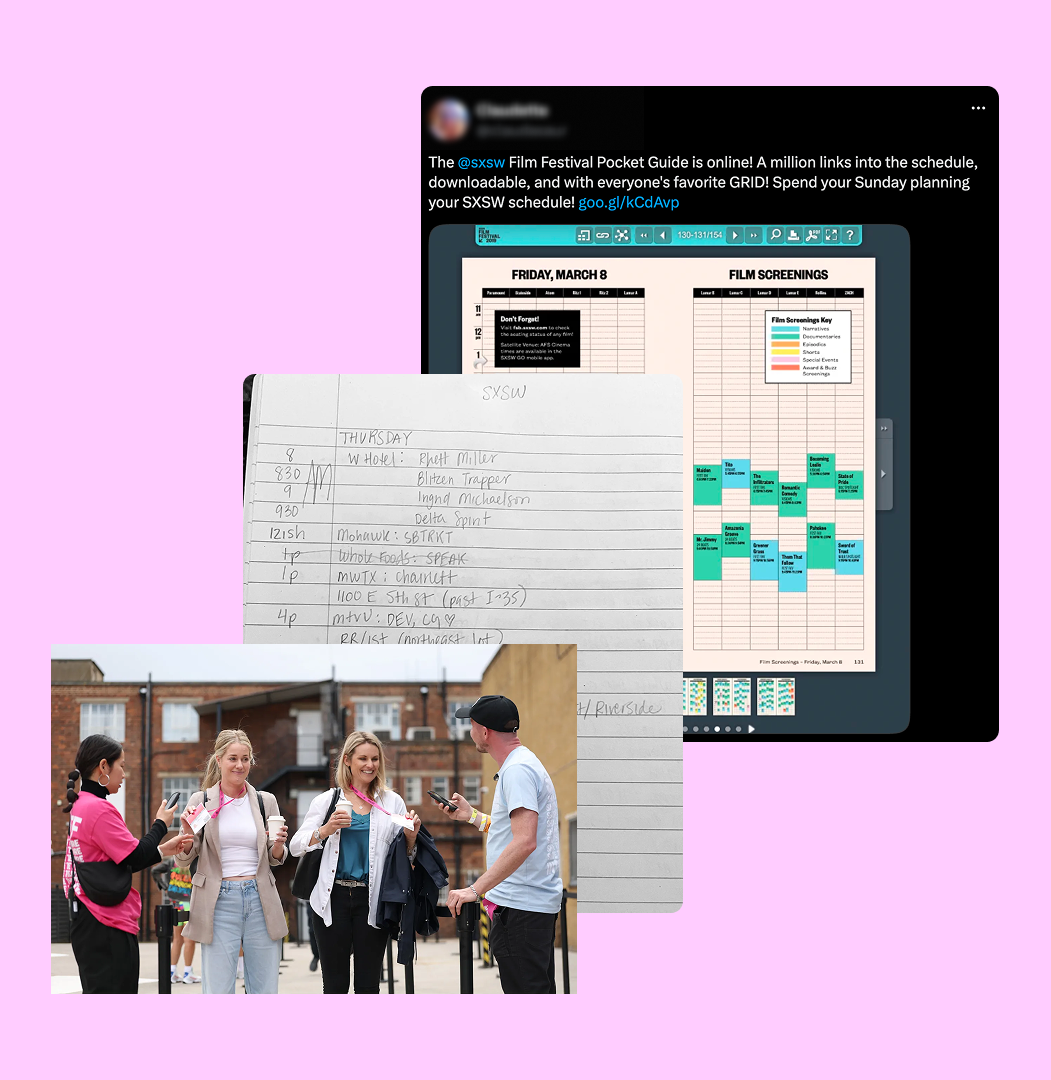
- Strategic Planner: Builds a complete agenda before arriving and values reliability.
- Spontaneous Explorer: Preferred discovering sessions as they explored the event.
- Super Networker: Cared more about meeting people than attending talks.
Designing for these behaviors helped the product support different planning styles without creating unnecessary complexity.
Defining Success
A cross-functional workshop aligned the team on goals and success criteria. The product needed to help attendees confidently build schedules, navigate venues without confusion, and encourage meaningful networking.
Business goal: dramatically reduce the time to launch future branded events.
Building for Scale
The Problem Inherited
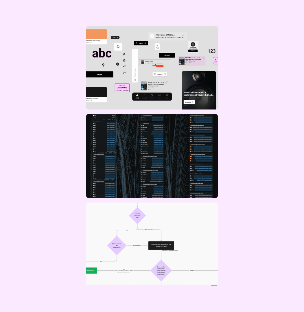
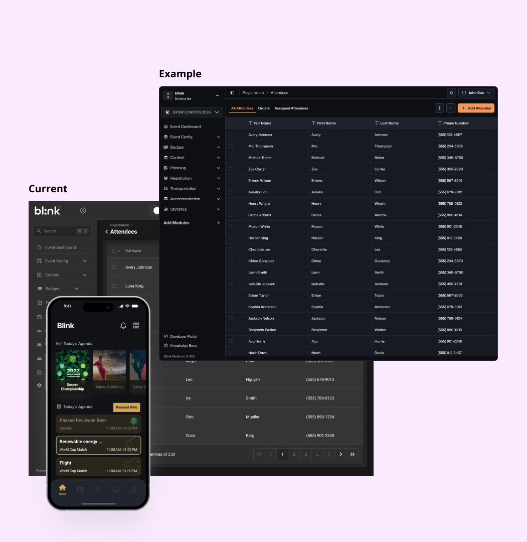
Brand switching took 8–12 weeks. There was no single source of truth, dozens of duplicated components, and roughly 90% of instances were detached or overridden from the base components.
I led rebuilding bl:nk's design system.
To deliver at this scale with a two-person design team, I first had to fix the foundation. Full Design System Case Study: Link
- ~90% detached components → ~98% adoption for the design system
- 8–12 weeks brand switching → 3–5 days
- SXSW London: 50+ screens shipped with zero detached instances at handoff
- Faster, and more consistent design and development
Key Screens
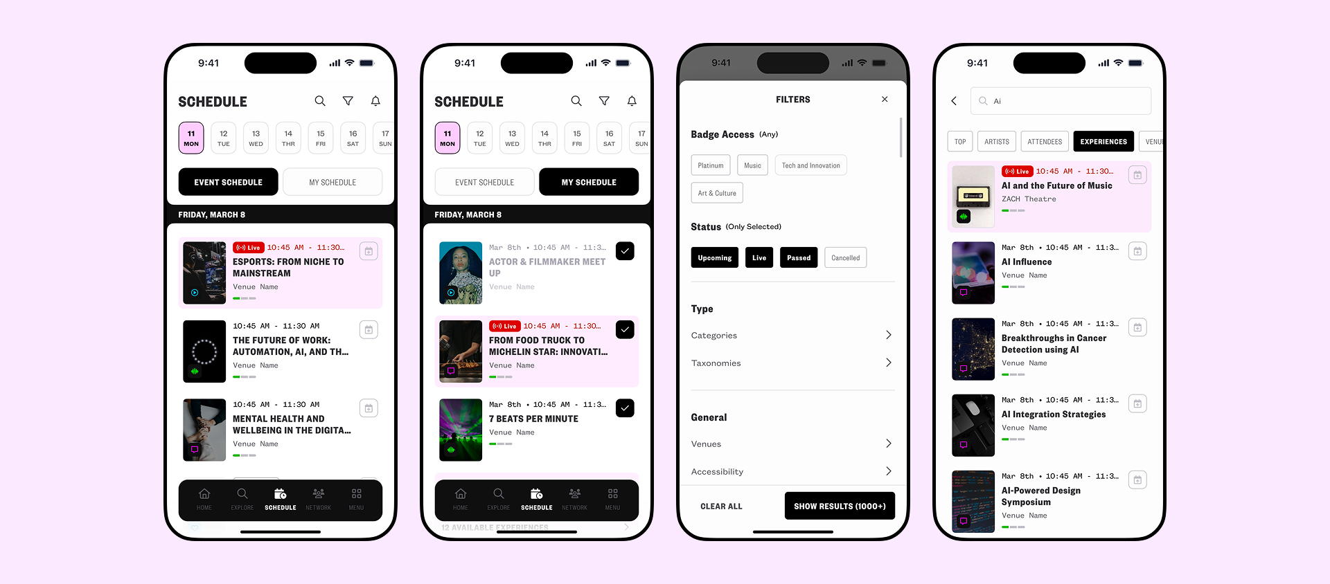
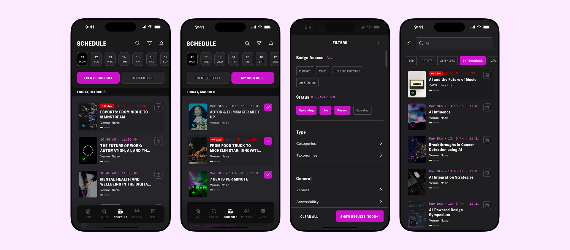
Mobile experience built around four core needs: Schedule, Navigate, Connect, Discover.
Schedule Builder
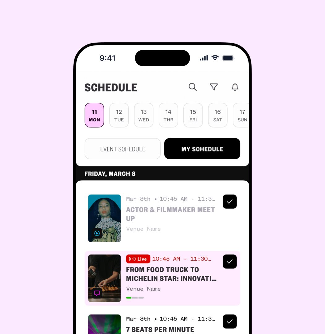
A central hub to help users find sessions and manage their agenda.
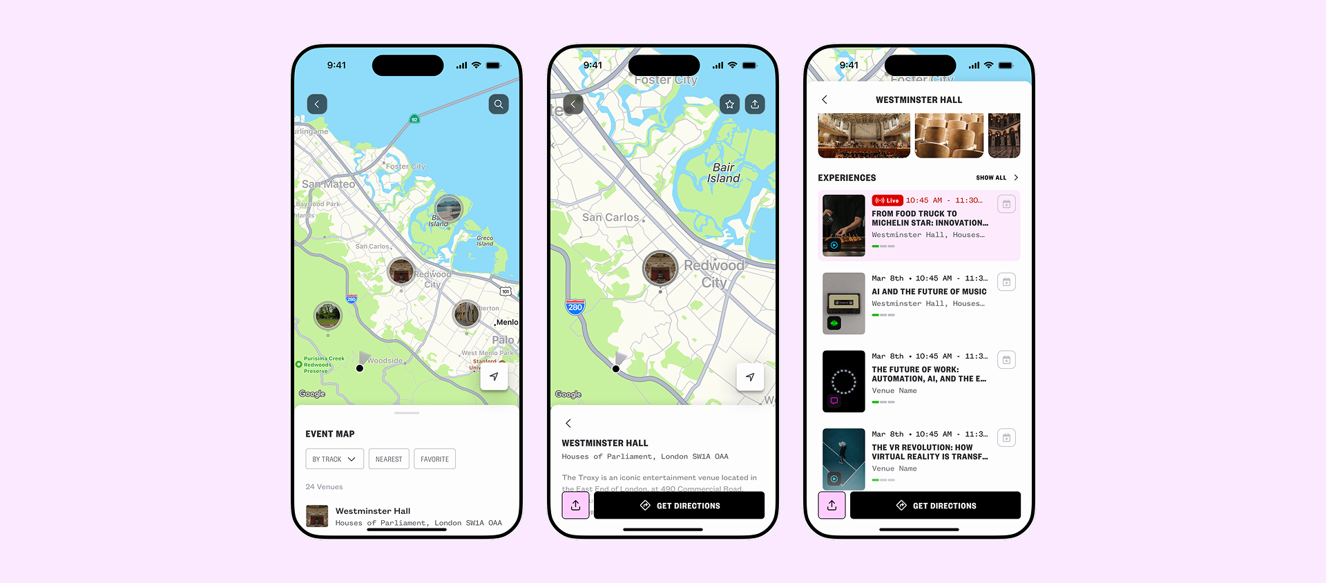
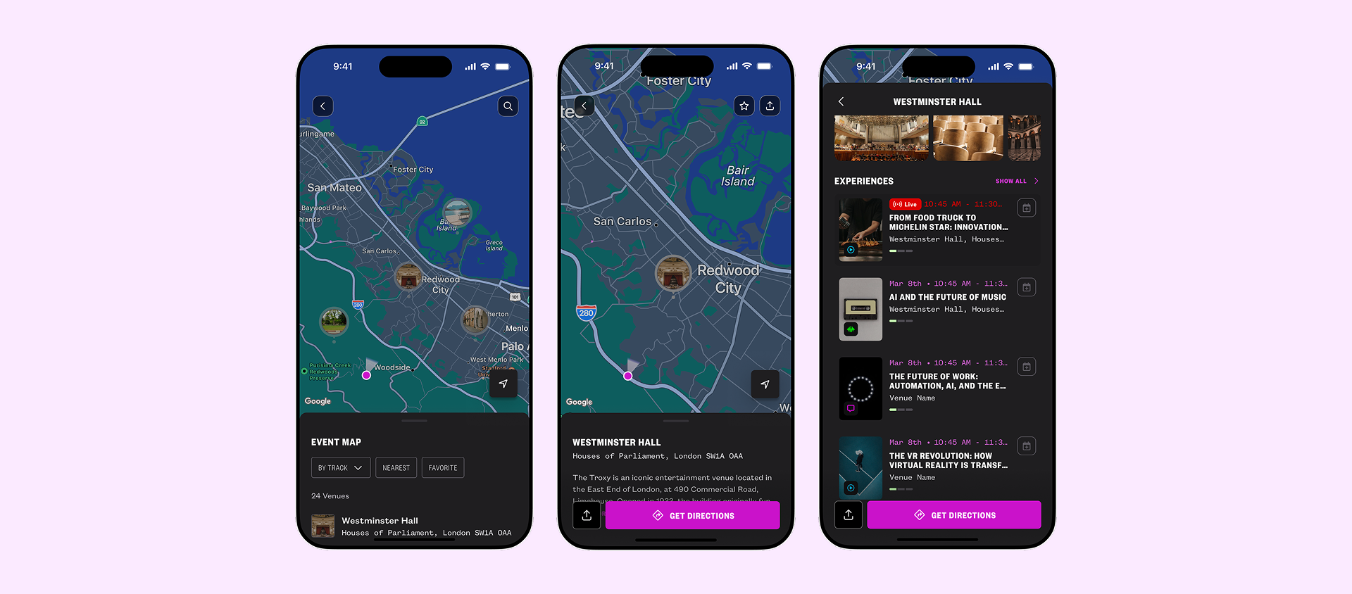
Venue Navigation
Navigate complex venues with confidence.
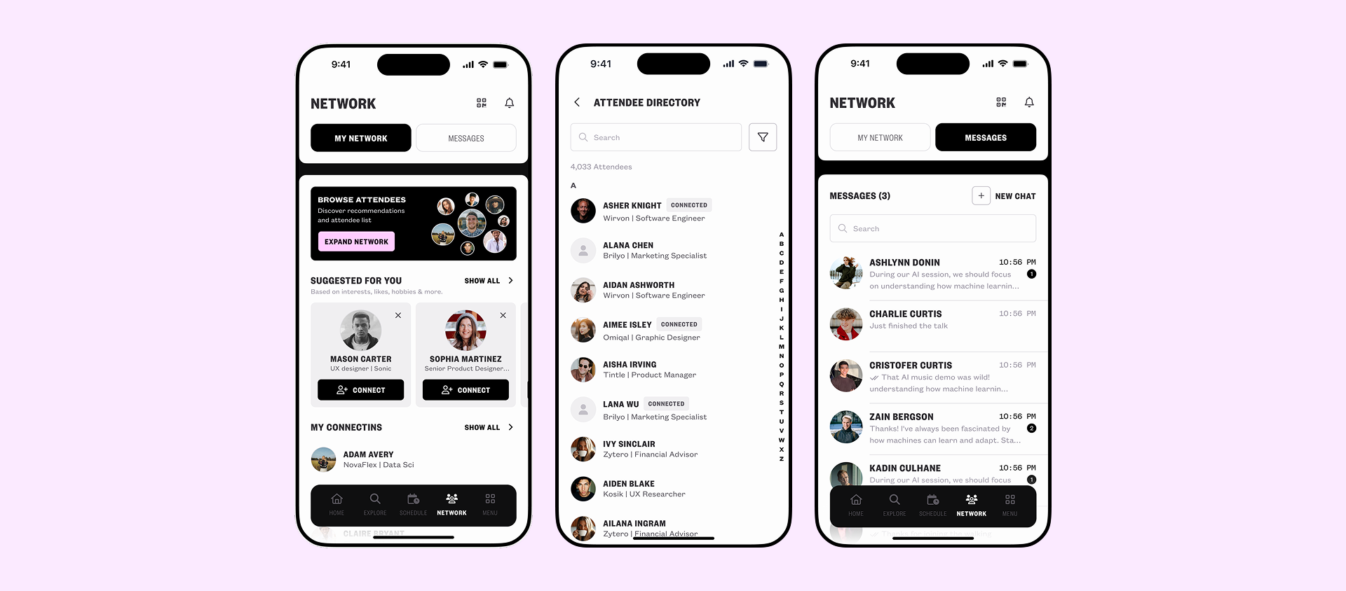
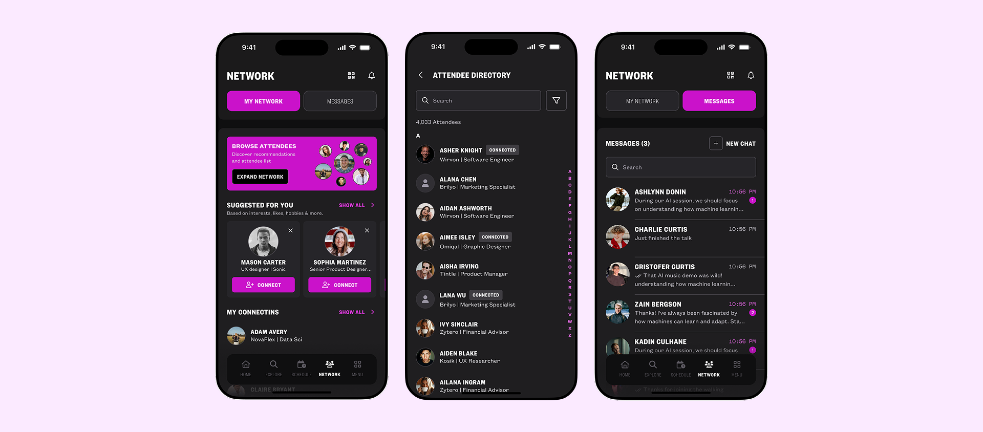
Networking Hub
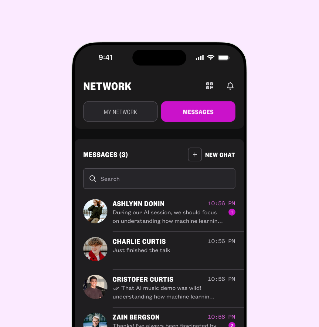
Discover and connect with relevant attendees.
Validation & Iteration
Usability Testing
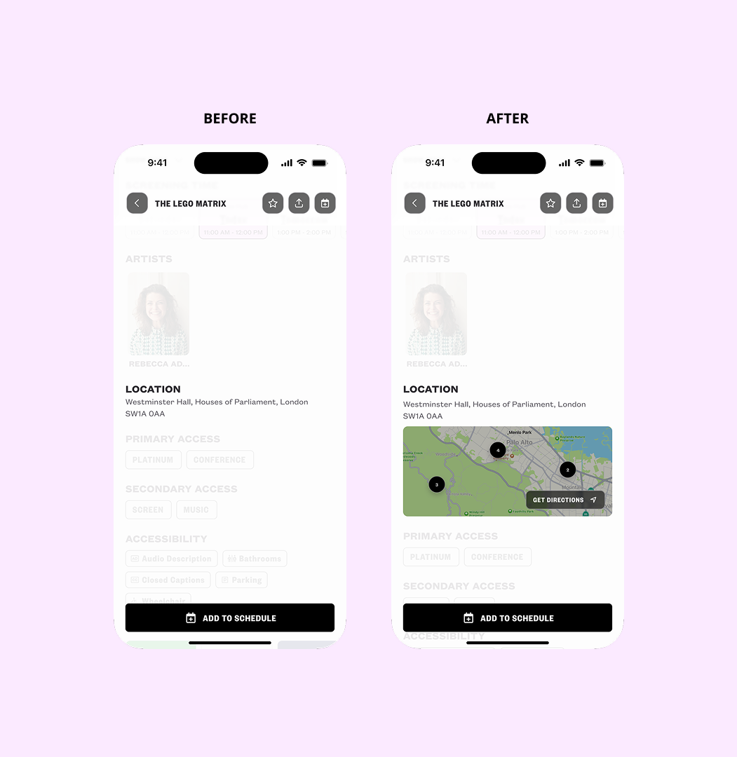
Tested the venue navigation flow with 5 past event attendees through moderated, task-based testing.
Finding
Users instinctively looked for navigation within the session details screen. Exiting to search manually felt frustrating.
Design Decision
Added a "Get Directions" action directly to the session details screen, reducing steps and matching users' mental model.
Implementation & Handoff
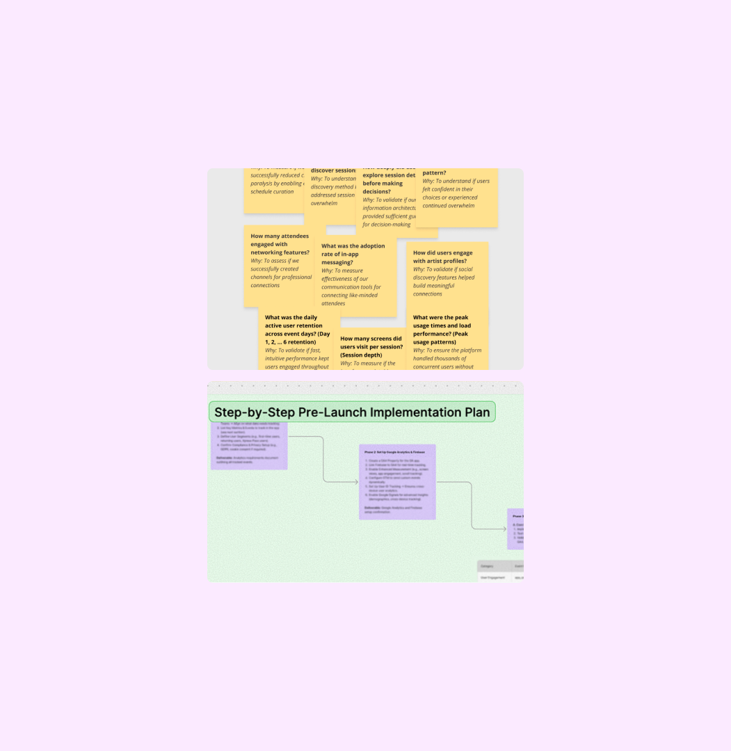
Close partnership with engineering, including comprehensive handoff covering interaction states and edge cases. Defined the event tracking strategy prior to launch.
On-call during SXSW London for rapid issue response, monitoring analytics in real-time.
Results & Impact
24K Daily Active Users ~94% of all event attendees actively used the app (industry benchmark: 40–60%).
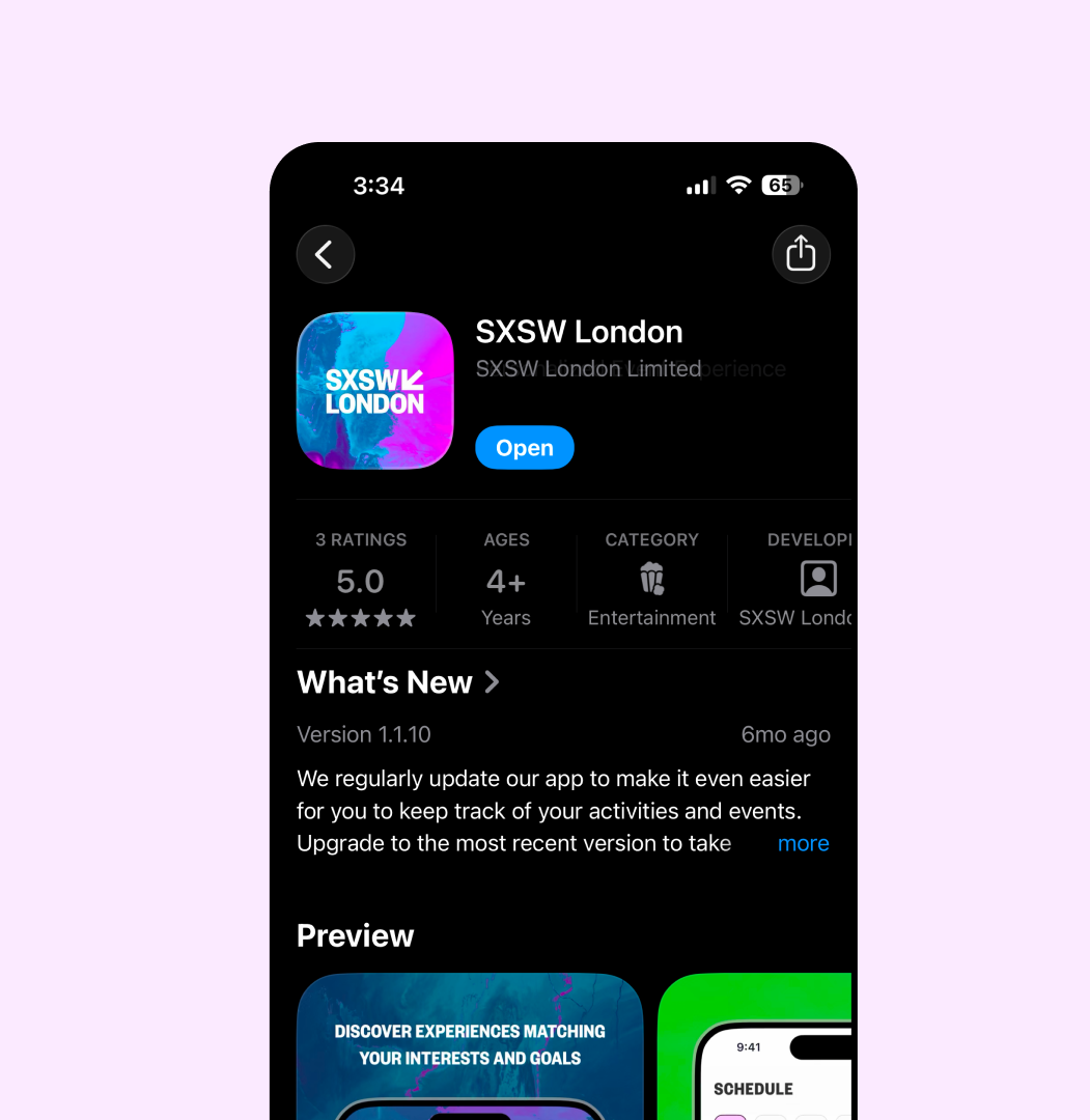
71.3% Conversion Rate Of sessions added to schedule, 71.3% were actually attended, verified by QR scan. Strongest indicator that the scheduling UX built genuine planning intent.
17.8K Conversations Started Proves meaningful engagement.
6 Platforms Design System Adoption Headless design system now adopted across MD, Organizer, Shop, VIP, ID, and Users dashboard.
Post-Launch Insights & Iteration
The Problem
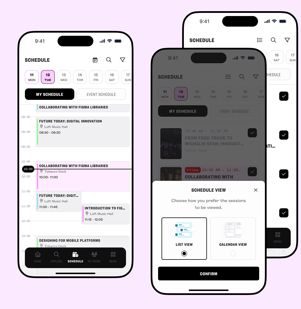
Planning intent was strong attendees were building out substantial personal schedules early. But the list view gave no visibility into time conflicts: overlapping sessions looked identical to compatible ones until a user was already deep into a broken plan. This was a visibility failure, not a motivation failure.
How I Caught It
Post-launch analytics surfaced two related signals: a notable share of saved sessions were later removed as users self-corrected scheduling conflicts, and a comparable share of planned sessions were never attended at all. Read together, one metric showed users who caught the conflict, the other showed users who didn't.
Usability sessions confirmed the mechanism behind the numbers: users consistently described losing track of overlapping sessions and only noticing them after committing to most of their schedule.
The Solution
I designed a calendar view displaying sessions on a time-based grid, making conflicts visible at a glance. Rather than replacing the agenda view, the solution added a toggle agenda for quick scanning, calendar for planning and conflict resolution.
Reflections

"Each product I help shape, shapes me in return, refining how I think, see, and build what comes next."
Scalable product design is about creating systems that allow products to evolve. Launching a meaningful, functional product beats delaying for theoretical perfection. The biggest lesson was balancing user needs, business goals, technical constraints, and delivery realities.