
Design Tokens: The Architecture Behind the System
How I designed the token foundation that cut rebranding from 8 weeks to 3 days and scaled across 6 products
Project Overview
This is the deep-dive into the token system behind both the Design System rebuild and the SXSW London app. If you've read either of those case studies, this is what made those results possible. The token architecture wasn't a side deliverable, it was the foundation everything else was built on.
My Role
Senior Product Designer. I owned the token architecture end-to-end, from auditing the existing chaos to designing the naming system, defining the 3-layer structure, and rolling it out across teams. This wasn't just a Figma exercise. I worked directly with developers to make sure the token names matched what shipped in code.
Timeline & Context
Built in parallel to live product work over 3 months, then rolled out progressively across 6 products over the following quarter.
The Challenge
Blink operates across multiple products serving different clients and brands. Every product team was working from their own version of the truth.
- Designers were hardcoding hex values directly into components. The same blue appeared as 14 different values across files.
- Developers used their own naming for the same colors, no shared vocabulary between design and engineering.
- Rebranding for a new client meant manually hunting through every file and every line of code. A single rebrand took 8–12 weeks.
- Dark mode was impossible to support at scale, every screen would need to be duplicated and manually updated.
- No one could answer the question: what is the single source of truth for this color?
The problem wasn't that the team lacked discipline. It was that the system gave them no structure to work within.
The Audit
Before designing anything, I needed to understand the full scale of the problem. I audited Figma files across 3 active products and documented:
- How many unique color values existed across components
- How many components were hardcoded vs. using styles
- Where designers and developers used different names for identical values
- Which properties were causing the most rework during client handoffs
What I Found
The audit confirmed what everyone suspected but no one had mapped: there was no system, just accumulated decisions made under pressure.
- Over 60 unique color values in active use, many duplicates of the same hue
- Zero semantic naming, values described what they looked like, not what they were for
- Developers maintaining a separate color file with different names
- Every new client project started from scratch
Key Insight
The real problem wasn't inconsistency. It was that the team had no shared language. Designers, developers, and product managers couldn't talk about visual decisions using the same words. A token system wasn't just a technical fix, it was a communication infrastructure.
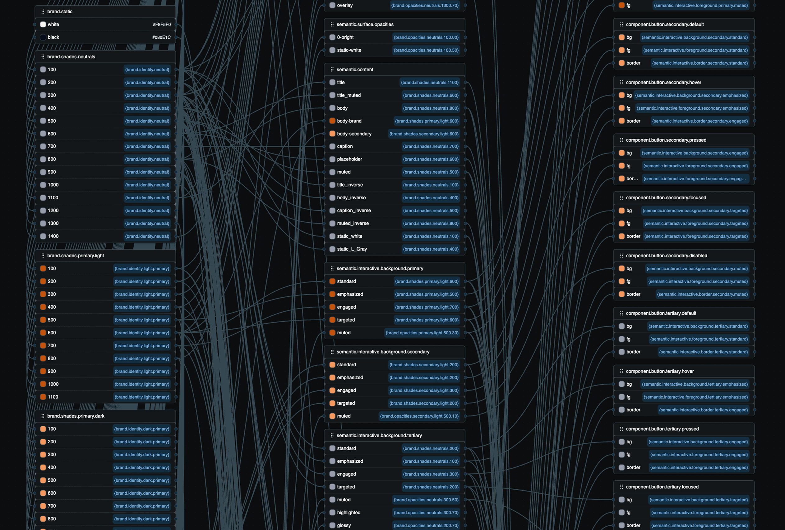
Defining the Architecture
Why 3 Layers
I looked at how other multi-brand, multi-platform systems handled tokens. The clearest pattern was a 3-layer hierarchy, not because it's the only way, but because it maps directly to the three questions teams ask:
- • What is this value? → Primitive
- • What is it for? → Semantic
- • Where specifically is it used? → Component
Any fewer layers and you lose the ability to retheme without touching components. Any more and you add complexity teams won't maintain.
Layer 1, Primitives
The raw values. Every color, size, weight, and radius the system uses, named by what they are, not what they do. These are never used directly in components. Their only job is to be referenced by the semantic layer.
Examples: brand/primary/500, gray/900, space/4, radius/md
Layer 2, Semantics
This is where meaning lives. Semantic tokens reference primitives and communicate purpose. This layer is what makes theming, dark mode, and rebranding work, you swap what a semantic token points to, and everything downstream updates automatically.
Examples: color/background/primary, color/text/secondary, color/interactive/primary/standard
Layer 3, Components
The most specific layer. Each component gets its own named tokens pointing to semantics. This lets you restyle a button's background without changing the semantic layer, and vice versa.
Examples: button/primary/background, input/border/default, tag/brand/background
The Resolution Chain
Every value in the system traces a clean path:
Change the brand color once at the primitive level. Every semantic token that references it updates. Every component token that references those semantics updates. Every screen, across every product, follows.
Naming Conventions
Getting the architecture right was only half the work. A token system is only as good as how readable its names are. If a developer can't look at a token name and know exactly what it's for, they'll stop using it.
Three Rules I Set
color/blue/500
tells you the value. color/interactive/primary/standard
tells you when to use it. A designer picking a color for a CTA button shouldn't have to guess, the
token name should make the right choice obvious.
Every semantic token follows the same pattern: category / context / variant / state. Once a designer or developer learns this once, every token they encounter, even one they've never seen, becomes immediately readable.
The best naming system is the one your team actually follows. I prioritized predictability over elegance. If two names could mean the same thing, I picked one and documented why. Ambiguity in naming is how systems break down over time.
Implementation
I didn't rebuild everything at once. Stopping all product work to migrate wasn't an option, and even if it were, it would have killed team trust in the system before it had a chance to prove itself.
How I Rolled It Out
I built the full primitive layer and made it available immediately. No migration required. New work started using it right away.
I used the development of a new product as a testing ground. The entire product was built using the semantic token layer from day one. This proved the system worked at scale and gave the team something concrete to point to.
Starting with buttons, inputs, and navigation, the highest-frequency components, I built the component token layer and used design critiques to roll it out to the rest of the team.
Existing products weren't force-migrated. Every time a component was touched for a feature, it was migrated. Within one quarter, adoption hit 98%.
Results & Impact
- Brand switching: 8-12 weeks → 3 days
- Token adoption: 98% across all new product work in one quarter
- Products using the system: 6
- Dark mode support: enabled for the first time across all products, zero component-level changes required
- Developer queries about color values: dropped significantly, shared naming eliminated the back-and-forth
- SXSW London: 50+ screens shipped by a 2-person design team in a fraction of the usual time, the token system was the reason the pace was possible
Reflection
"A token system is not a design deliverable. It's a team agreement written in code."
What I learned
- Small wins matter: The hardest part wasn't the architecture, it was getting the team to trust something new after the previous system had failed them. Small wins early matter more than a perfect structure on paper.
- Co-ownership is key: Naming conventions are only valuable if the whole team owns them. I involved developers and product managers in naming decisions early. That co-ownership is what made the system stick.
- Success means it's boring: Tokens are infrastructure. Nobody sees them, they only notice when they're missing. The measure of success is that rebranding became boring.
What came next
This token system became the foundation for the full design system rebuild and directly enabled the SXSW London delivery. It's the connective tissue between both of those case studies, and it's still live across 6 products today.